Balance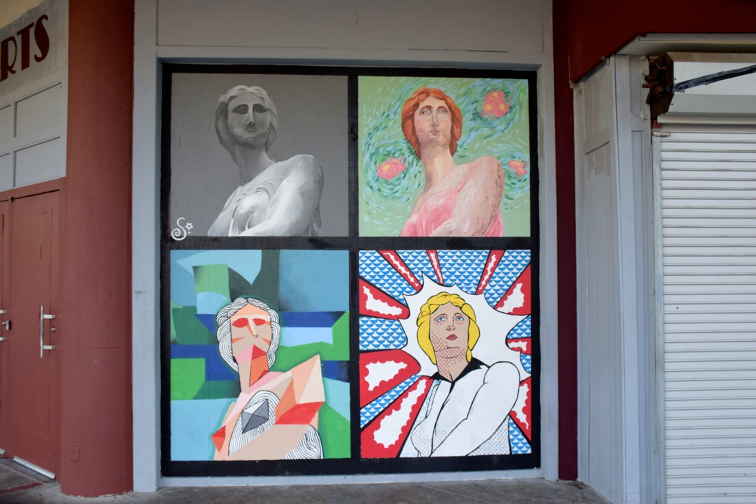 ISO: 400 f/8 Shutter Speed: 1/90 In this photograph, balance is shown through the paintings being symmetrical to each other. By taking a picture of the copied portrait, I was able to successfully capture balance through the painting showing the same image right next to one other and resembling the symmetry of butterfly wings. The photos are symmetrical through the image being replicated and placed side-by-side. Variety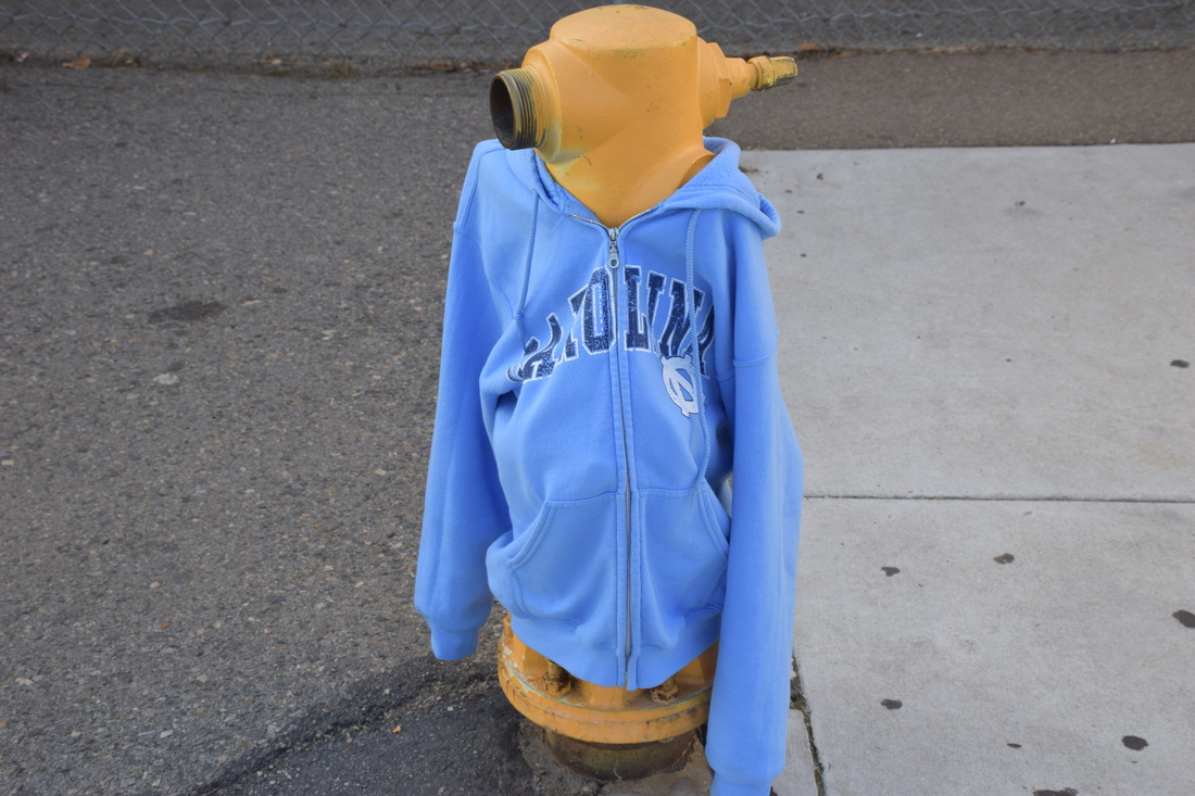 ISO: 400 f/8 Shutter Speed: 1/180 This image displays variety through the use of contrasting colors and elements. I was able to show variety by placing my jacket on the fire hydrant, thus allowing for the hydrant to replicate a person wearing the clothing. This successfully shows variety through the the different objects coming together to create a figure and building a body by playing off one another. (the fire hydrant is the head and the jacket displays arms) Proportion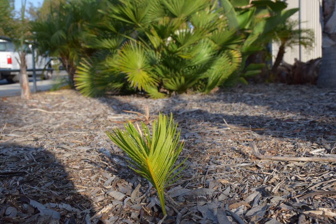 ISO: 400 f/8 Shutter Speed: 1/500 The image above shows proportion by comparing the small sprout to the full grown plant in the background. This successfully displays proportion by comparing the two sizes of the plants to one another. One is easily able to recognize the difference in growth from one another and identify the size relationship between the two objects. Rhythm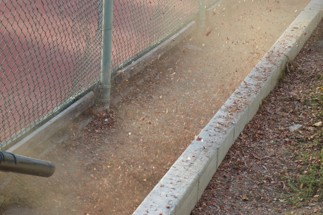 ISO: 400 f/8 Shutter Speed: 1/180 Rhythm is displayed in this image by showing the movement of the leaves being blown. This displays rhythm through the leaves all moving at once, giving way for the audience to see the picture in action. I was able to successfully capture rhythm through the use of a leaf blower, which allowed for the replication of leaves being blown to display active movement. Emphasis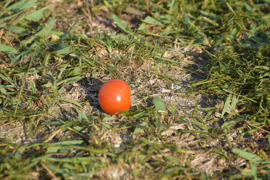 ISO: 400 f/8 Shutter Speed: 1/350 The image above uses emphasis through the difference in color. By using the bright red Cherry Tomato and placing it on the green grass, I was able to successfully show emphasis through the red being dominant over the other colors. The viewer is easily able to be guided to the tomato since the door stands out from the rest. By using the complimentary core, I was able to successfully show emphasis in the image. Harmony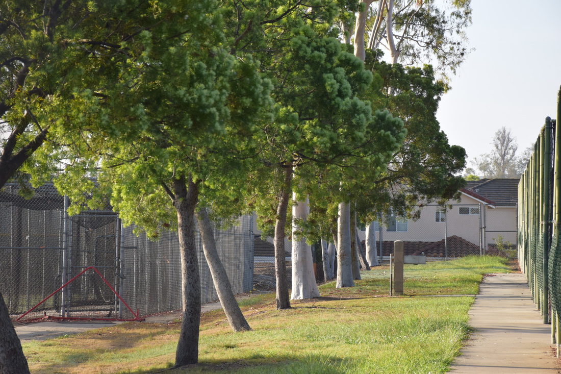 ISO: 400 f/8 Shutter Speed: 1/350 Harmony is successfully shown here through the green landscape reflecting the green trees. The repetition of green in the trees and in the grass, creates harmony through their pleasing quality to resemble each other through different types of greenery. Usually harmony pictures display a sunset, but in this image, I chose to use the trees as the top of the image (the sky) and use the grass to reflect off of the trees (the water). This image successfully shows harmony through shades of green in which opposite elements compliment each other. Unity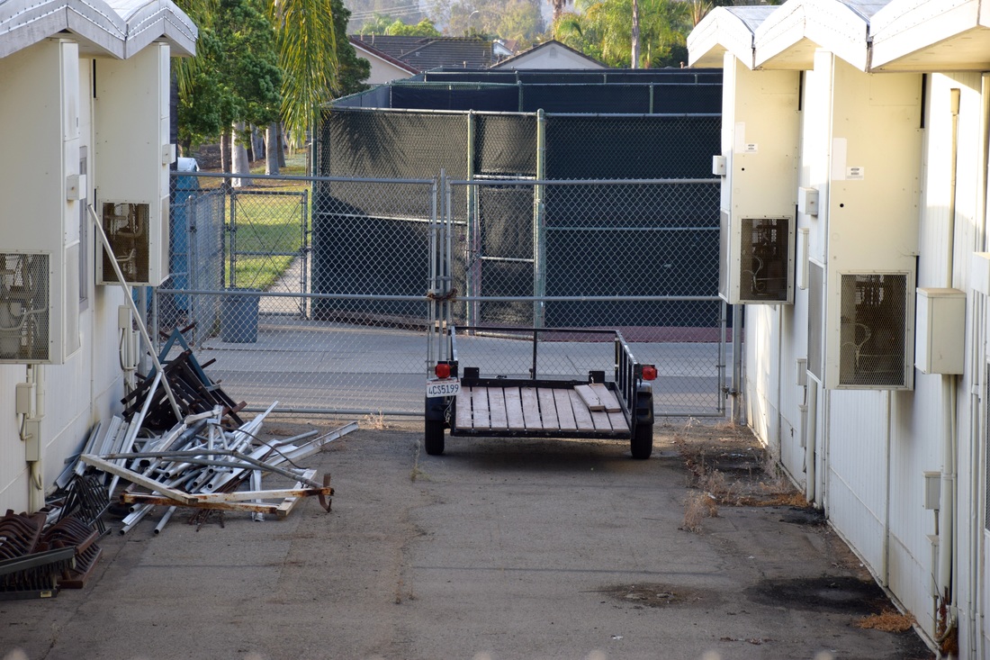 ISO: 400 f/8 Shutter Speed: 1/250 This image shows unity through the dar tones found in the area. With the use of the brown wood in the trailer, the brown dark ground, and the shadow overcasting the area, shades of brown are used here to create the image to pull the picture all together. Not only is color used but as well as material in which the objects are built of. The fence, the pile on the ground, and the trailer are all made of metal. With the use of material being comparable, unity is dominantly shown here through dark tones and material of the objects coming together to create a sense of oneness.
0 Comments
Elements art notes:
Line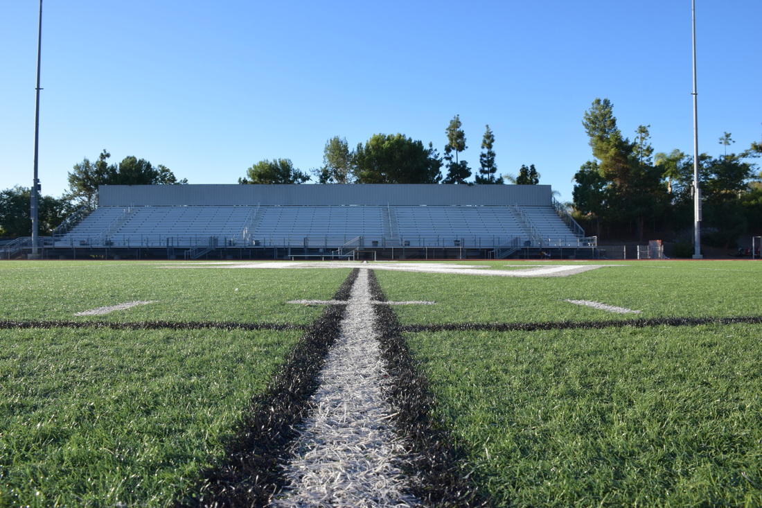 ISO 500 f/13 Shutter Speed: 1/250 This image displays line through the painted line on the field. Centered, the image displays a vertical guidance to lead the observer to view the stands. Successfully leading the audience to look into the stands through the line leading the way. Being the main focus in the image, the audience is able to easily see the pathway of the line and its purpose. Color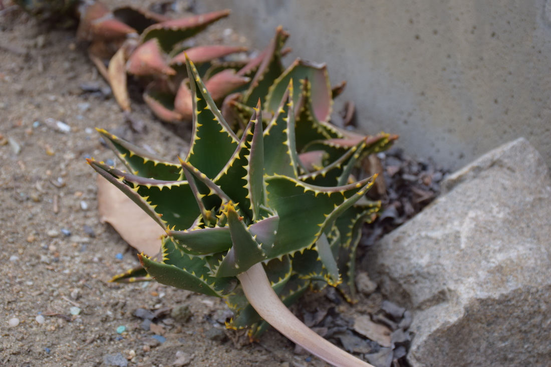 ISO: 400 f/8 Shutter Speed: 1/180 This image displays color through the focus of the green plant compared to the dark background. By getting close to he succulent, I was able to successfully display color through cool tones. By using the darker background, I was not only able to display color, but as well as emphasis in order to show the contrasting colors. Shape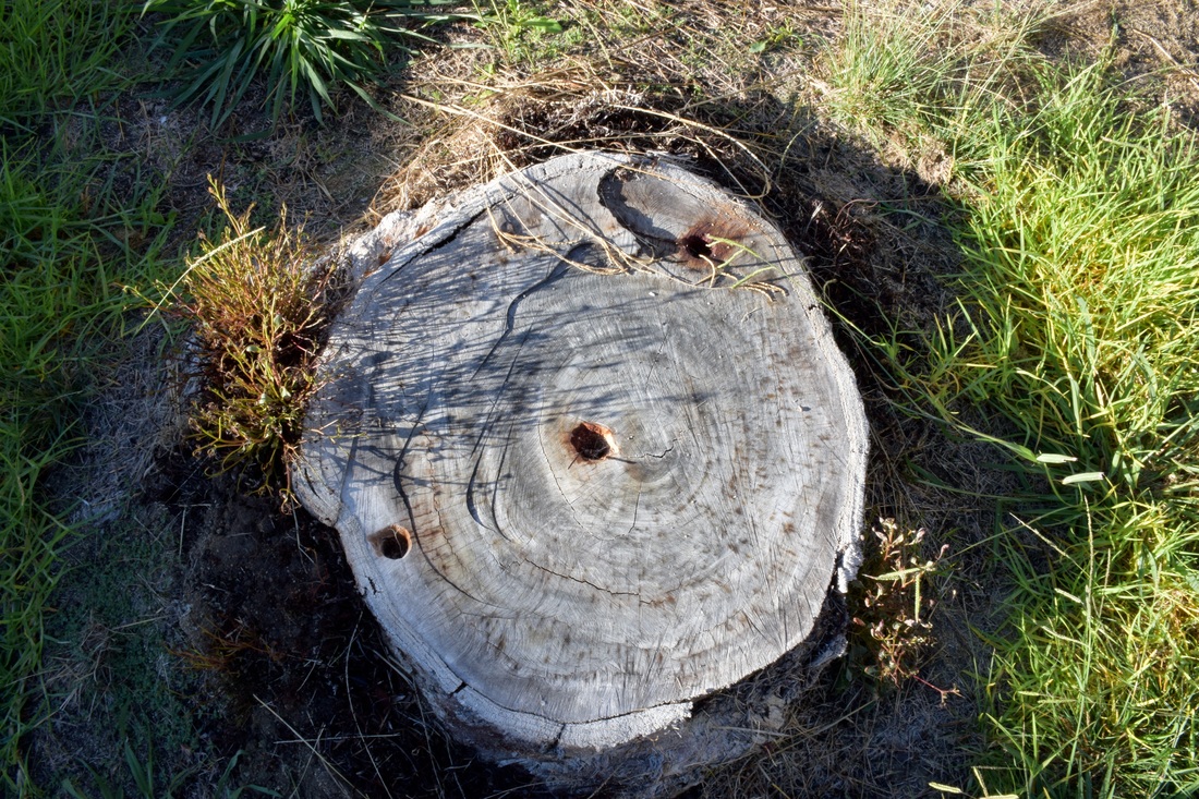 ISO: 500 f/22 Shutter Speed: 1/45 Shape is shown in the image above through the circular shape the tree stump takes. By tang the image from a bird's eye view, I was able to successfully display shape in nature. Through the circular shape of the tree stump, shape takes place naturally. The tree shows height and width through the side of the tree being shown, as well as how wide the tree stump is. Form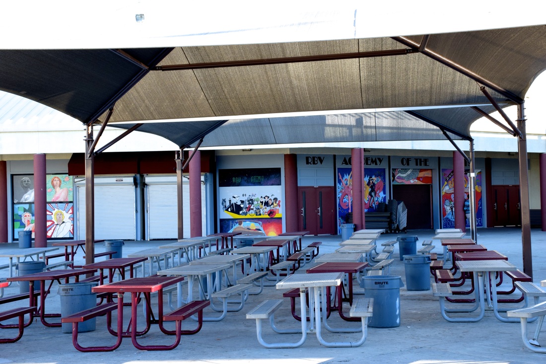 SIO: 500 f/16 Shutter Speed: 1/45 Form is displayed here through the display of height, width, and depth of the lunch area. With the help of the shade cover, height is successfully displayed. The tables give way for the image to show depth in the way they all lead to the theater. Width is shown through how wide the lunch area is. From table to table. By using the lunch area, I was successfully able to show form through the three dimensional aspects in the image. Texture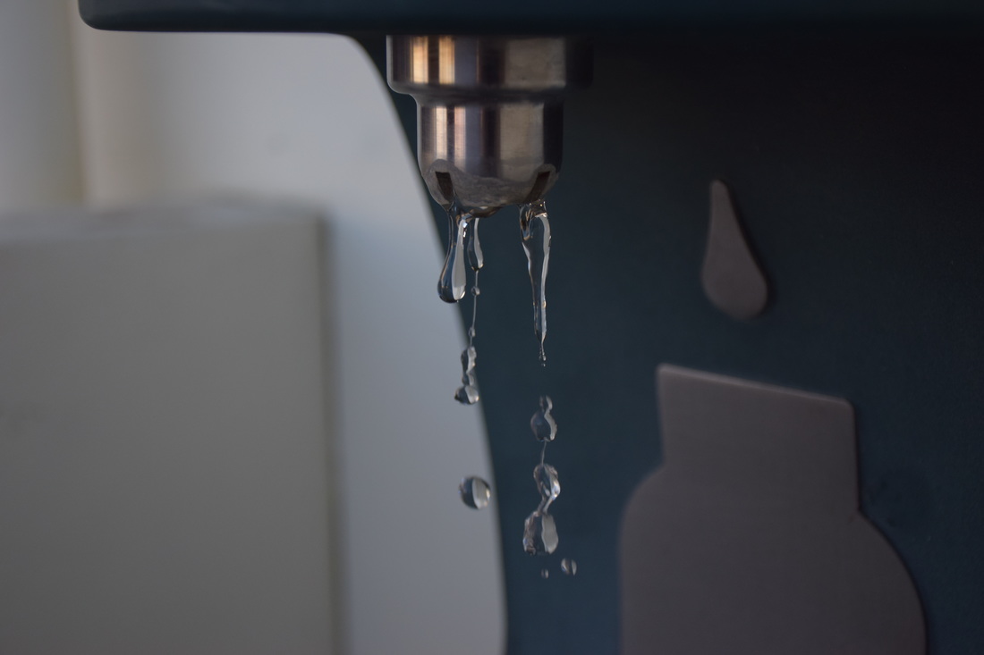 ISO: 500 f/4.2 Shutter Speed: 1/1000 The image above shows texture through the close up of the water fountain. Wanting to do something different other than plant life or something easy to hold, I captured the flow of the water fountain turned on. By taking a picture of water, I was able to show texture by displaying something everyone touches everyday. By looking at the image, one is able to feel the water running, since the liquid is familiar to touch. Space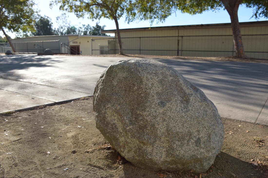 ISO: 500 f/8 Shutter Speed: 1/1000 Space is displayed through the rock being placed in an open area. By showing the rock as a focal point, I was able to successfully show the positive and negative space in the image. The open space is able to show the negative space by showing the "openness" of the background. By showing the rock as a focal point, I was easily able to display space around and behind the object. Value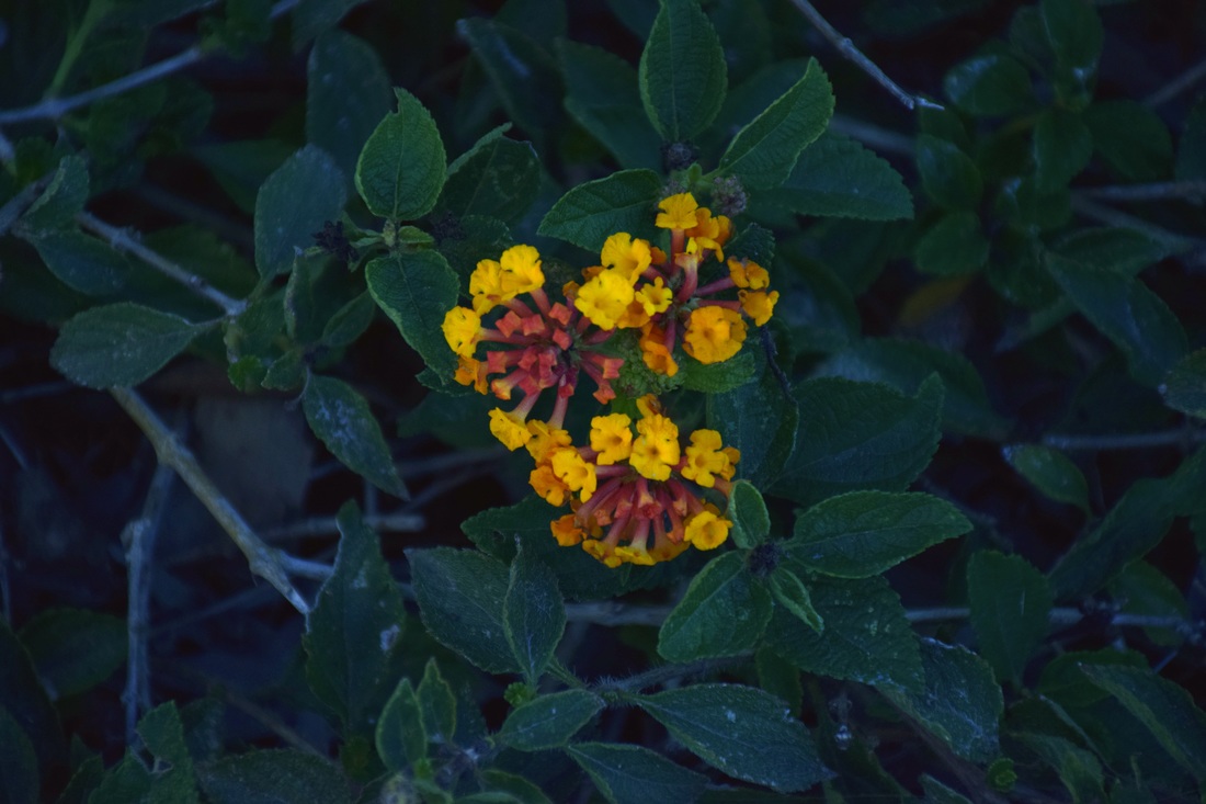 ISO: 500 f/5.6 Shutter Speed: 1/1000 Value is displayed in this image by placing a light object on top of a dark object. The lightness of the flower in contrast to the darkness of the leaves, puts emphasis on the value in the image. By using the different colors in the plant life, I was able to display value in the way the two objects display contrast in darkness and lightness when place on top of one another.
Line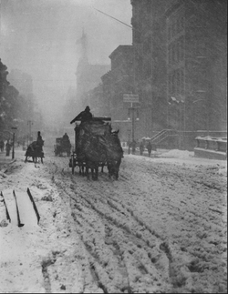 Alfred Stieglitz, Winter, Fifth Avenue (1892) http://www.theartstory.org/artist-stieglitz-alfred-artworks.htm#pnt_1 In this photograph, line is displayed through trails in the snow. Taken on Fifth Avenue, Stieglitz was able to vertically lead the audience's eyes to the focal point, a dark horse attached to a carriage. By using the vertical trails in the snow, the photographer was able to successfully lead the viewer to see the man, swallowed by the snow. Line:
Color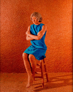 Spirituality in the Flesh, Sandy Skoglund (1992) http://www.sandyskoglund.com/pages/imagelist/imagelist%20home.html In this image, Sandy Skoglund is able to display the element of color through contrasting the blue dress with ground beef. The wall, furniture, and body are all covered in ground beef, showing the alternate contrast of person from clothing. Skoland is able to successfully use the difference in color to show the human body fully displayed in the flesh. Color:
Shape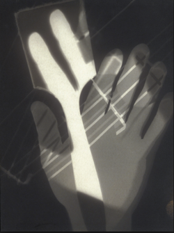 Photogram, Laszlo Moholy-Nagy (1926) http://www.theartstory.org/artist-moholy-nagy-laszlo-artworks.htm#pnt_2 Fascinated by light, Moholy wanted to capture an image through objects on light-sensitive paper, then capturing the object's silhouette in order to create a photogram. By using shape, Moholy was able to create a photogram using light exposure, thus creating a photogram of Moholy's hand holding a paint brush. Ironically, creating an image through a media opposite of paint works; his usual media. Shape:
Form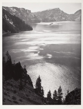 Afternoon Sun, Crater Lake National Park, Ansel Adams (1943) http://shop.anseladams.com/Ansel_Adams_Originals_s/71.htm In this image, Adams is able to successfully use three dimensions, through height, width, and depth. This shows the height of the mountain view, the width of the lake and mountains, and the depth of the lake. Giving off an image that displays an emphasis of highlights in the water and shadows of the mountains. Form:
Space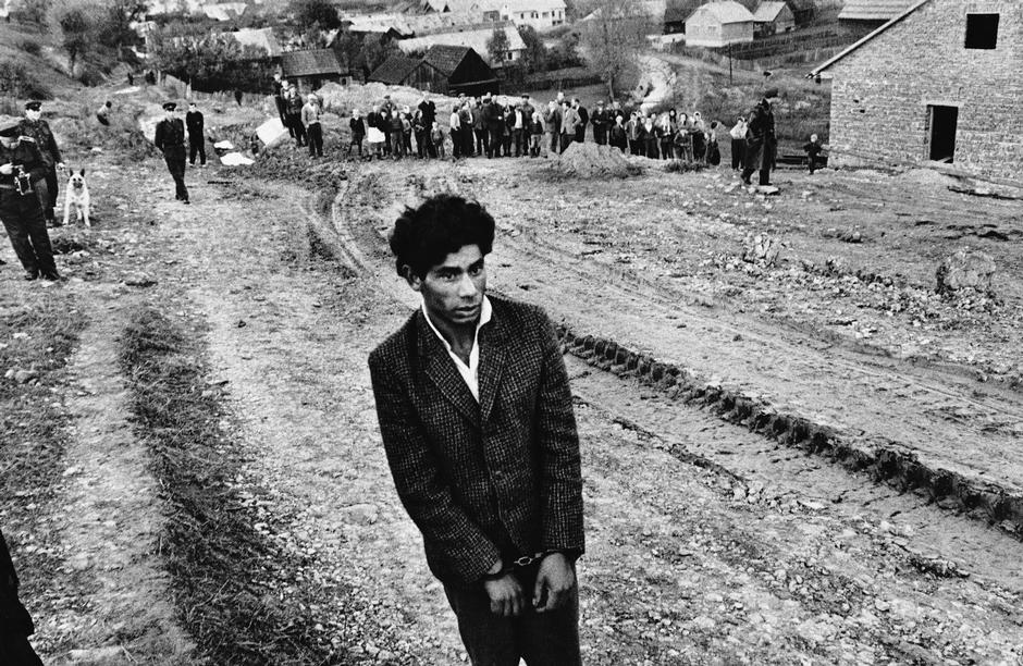 Slovakia. Jarabina. Reconstruction of a Homicide. Josef Koudelka (1963) http://pro.magnumphotos.com/C.aspx?VP3=CMS3&VF=MAGO31_10_VForm&ERID=24KL535C7T Space is used through the man standing alone. With no one around him and soldiers in the background, this displays how the youth, gypsies, were for themselves when convicted. The use of empty space drags the attention towards to gypsy on trial aswell as shows the man surrounded by soldiers, being captured. Space:
Value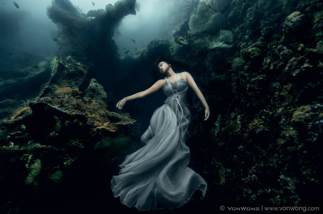 Elegance, Ben Von Wong (2014) http://www.vonwong.com Value is used in this image to display the contrast between the woman and the shipwreck. This shows the use of value through using darkness to emphasize the woman in the water. To display the beauty of the woman in contrast to the destructive ship wreck. The lightness of the woman is definite when placed within the dark rusted metal. Value:
Texture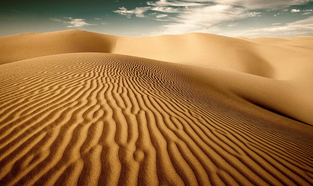 Beautiful Destinations, Travis Burke (date not given) http://www.travisburkephotography.com/BeautifulDestinations/ This image uses texture through the use of sand. By displaying the ripples and detailed physical texture of the sand, one is able to imagine how the dessert ground may feel. Allowing them have a visual sense of how the sand would feel in real life if touched. The close up gives way for someone to feel soft multiples of little rock at their fingertips. Texture:
Balance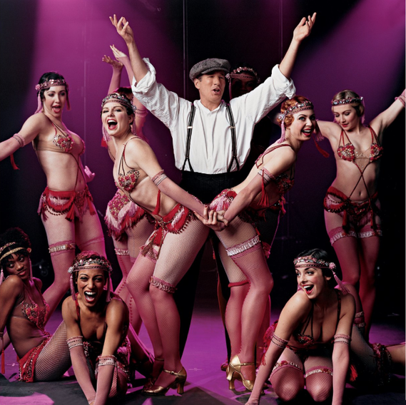 Vogue, Annie Leibovitz (2002) https://www.vogue.com/slideshow/photographer/annie-leibovitz/#12591704 Leibovitz shot this image of Richad Gere in Chicago. This displays balance by the dancers being symmetrical to each other. Surrounding the man in the middle, the dancers mirror each other in the way they are posed. Balance:
Proportion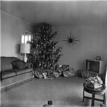 Xmas Tree in a Living Room, Diane Arbus (1963) http://www.mutanteggplant.com/vitro-nasu/2013/12/24/xmas-tree-in-a-living-room-by-arbus-the-tree-by-alechinsky/ This image shows proportion through the Christmas tree being placed in a small room. By showing the tree appearing to be going through the roof, proportion is successfully displayed by making the tree look very large when placed in a short, small room. Proportion:
Rhythm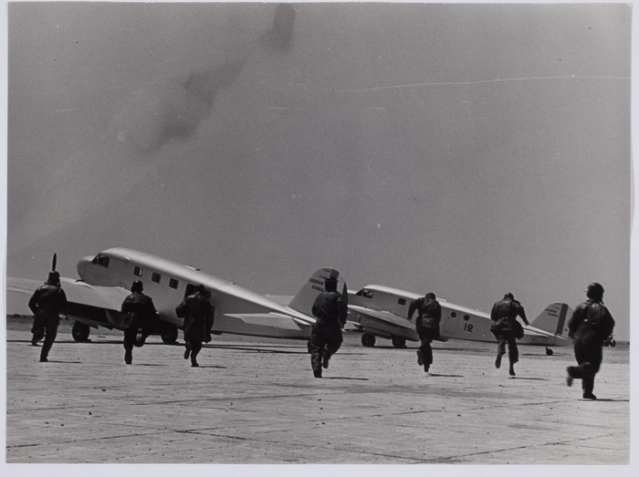 Airbase, Istres, France, Robert Capa (1939) https://www.icp.org/browse/archive/objects/airbase-istres-france-17 The image displays rhythm through the movement of men heading to the planes. With attack on-way, military men move into defense as Robert Capa captures the unit's movement. By taking the image, Robert Capa was able to show rhythm in the way the men are actively rushing to battle. Rhythm:
Emphasis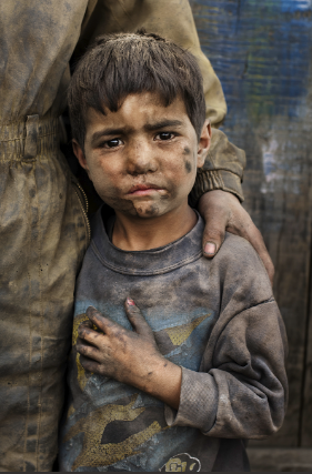 Afghanistan, Steve McCurry (2012-2016) http://stevemccurry.com/galleries/portraits The image above successfully shows emphasis by dragging the audience to look the boy in the eyes. By placing emphasis on the boy's face, the audience is able to see the challenges children and people face in foreign land and demand for the suffering to change. McCurry is able to emphasize the boy's discouraged expression in order to display his strong message. Emphasis:
Harmony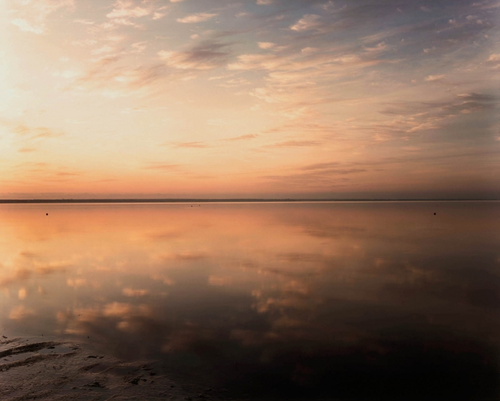 Bay Sky, Dawn, Joel Meyerowitz (1986) http://www.howardgreenberg.com/exhibitions/land-lines?view=slider#5 Harmony is displayed here through the mirroring of color between the water and the sky. Both reflecting the soft colors, harmony is displayed through the repetition of the pleasing colors in the sunrise. Harmony:
Variety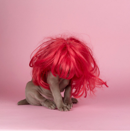 Hot and Pink, William Wegman (2004) http://www.panopticongallery.com/artist/wegman/#William_Wegman_29.jpg Variety is displayed strongly by two opposite objects being used to form a subject. With the dog wearing a wig, variety is shown through the differences in the two objects driving the audience to be amused. The interest that the image brings gives way to individualism in Wegman's images. Variety:
Unity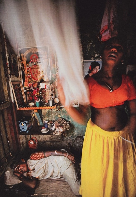 Mid-afternoon, Falkland Road, Bombay, India, Mary Ellen Mark (1978) http://www.anothermag.com/art-photography/7458/mary-ellen-marks-greatest-photographs
Unity is shown here through the people, the ground, and the building all resembling dark tones. By connecting the color of the people with the color of their surroundings, unity is displayed greatly with the unifying color play between elements. Tying the image together with the balance of dark tones. Unity:
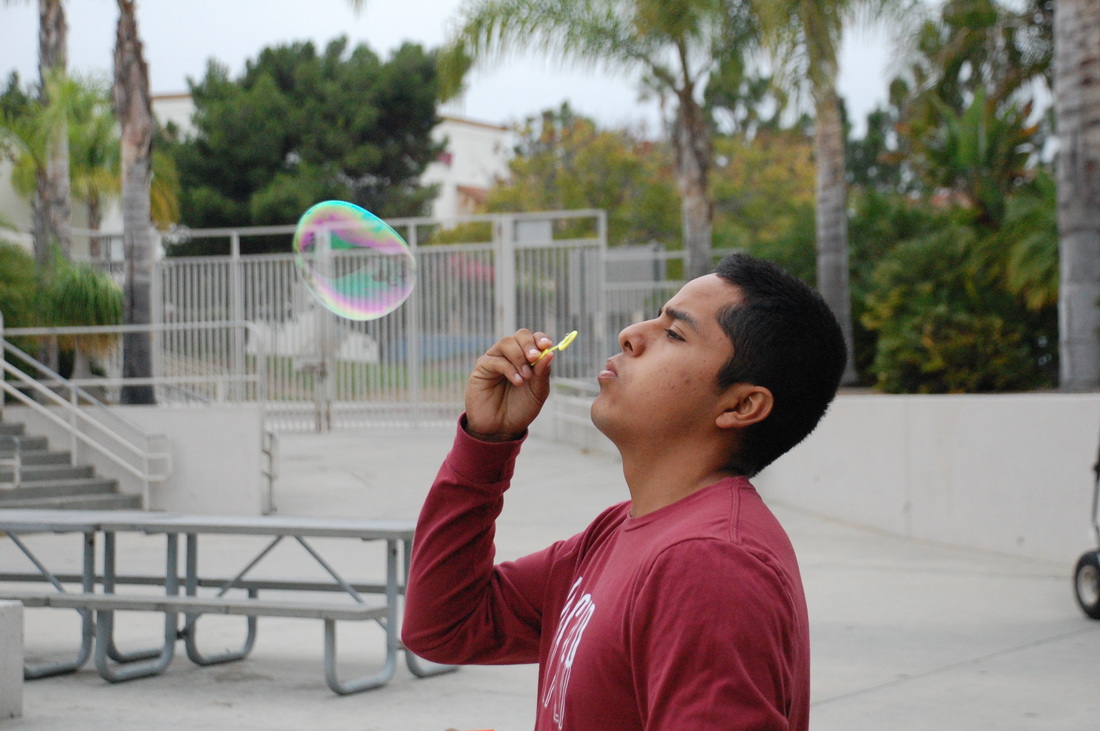 ISO: 1600 f/5.6 Shutter Speed: 1/320 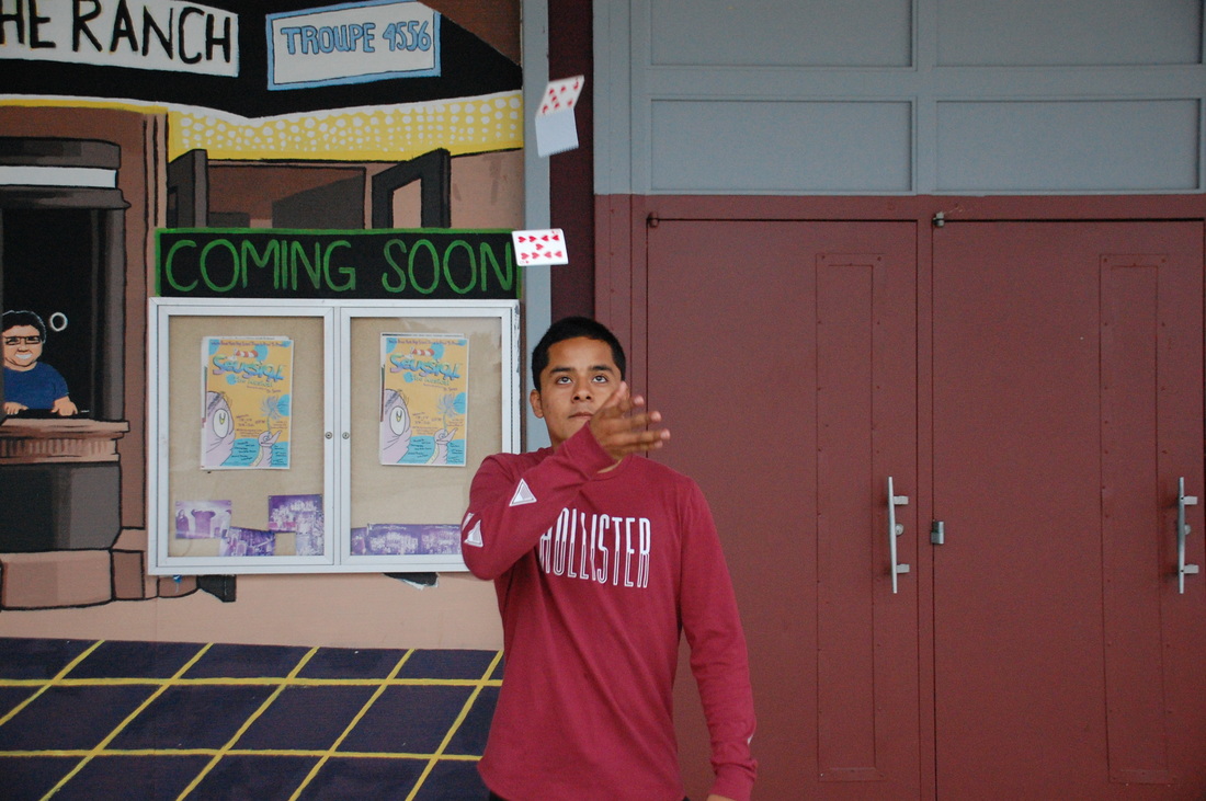 ISO:1600 f/4 Shutter Speed: 1/320 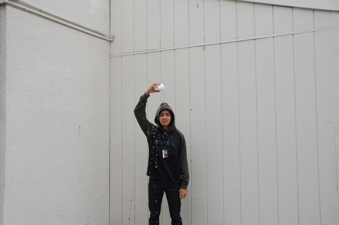 ISO:1600 f/8 Shutter Speed: 1/320 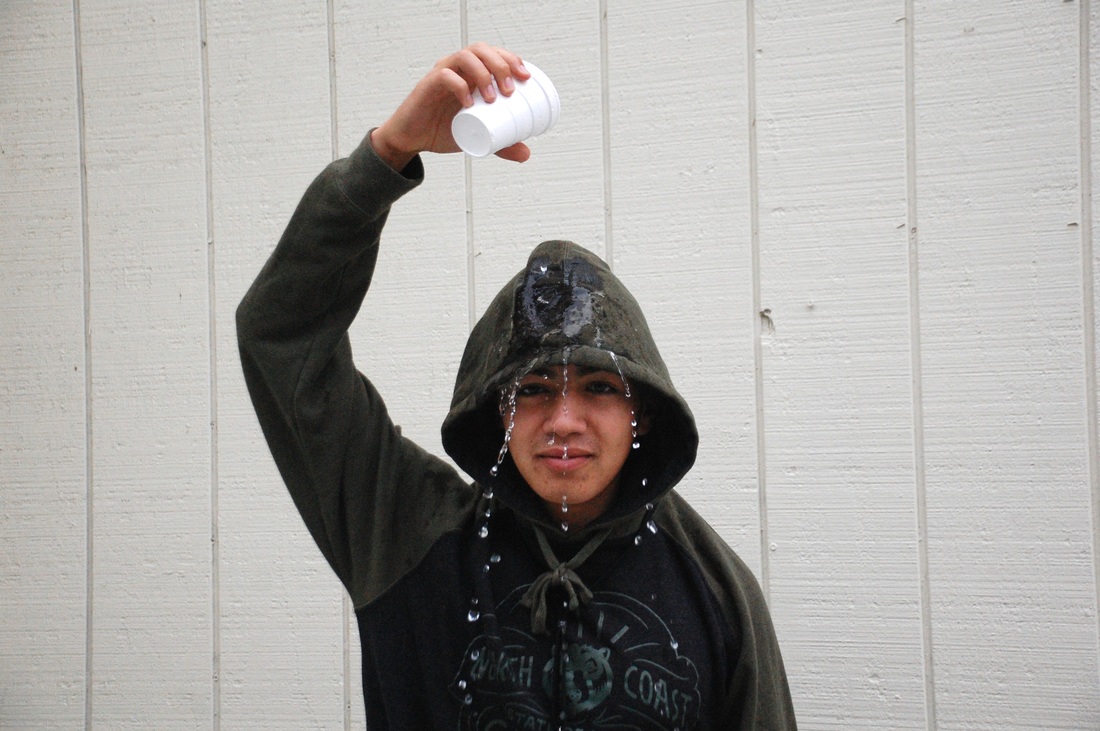 ISO:1600 f/5 Shutter Speed: 1/640  ISO:1600 f/5 Shutter Speed: 1/640  ISO:1600 f/4.2 Shutter Speed: 1/640  ISO:1600 f/4.8 Shutter Speed: 1/640  ISO:1600 f/5 Shutter Speed: 1/640 -To take the photographs, my partner and I changed the shutter speed according to the action performed. The ISO was set to 1600 and we adjusted the shutter speed to 1/1000. In order to capture an image, I held down the shutter button which allowed me to capture multiple images during one action.
-At certain shutter speeds, the lighting of an image would darken. By adjusting the shutter speed, I was able to change the lighting of the photo. If I did capture a photo that was too dark but I liked, I was able to adjust the lighting manually using the iPhoto settings. 1. Shutter speed adjusts according to light exposure 2. Holding down the butter button can giveaway to multiple images based off of one action 3. Taking images through shutter speed can not only freeze the action performed, but as well as the emotion expressed. -Other things that can be done using fast shutter speed are flip books. By holding down the shutter button, one is able to capture images that are continuous of the action. For instance, using the shutter button allowed me to capture images of one action consecutivey. When placed in a flip book, one is able to re-create the scene by quickly going through the images taken. 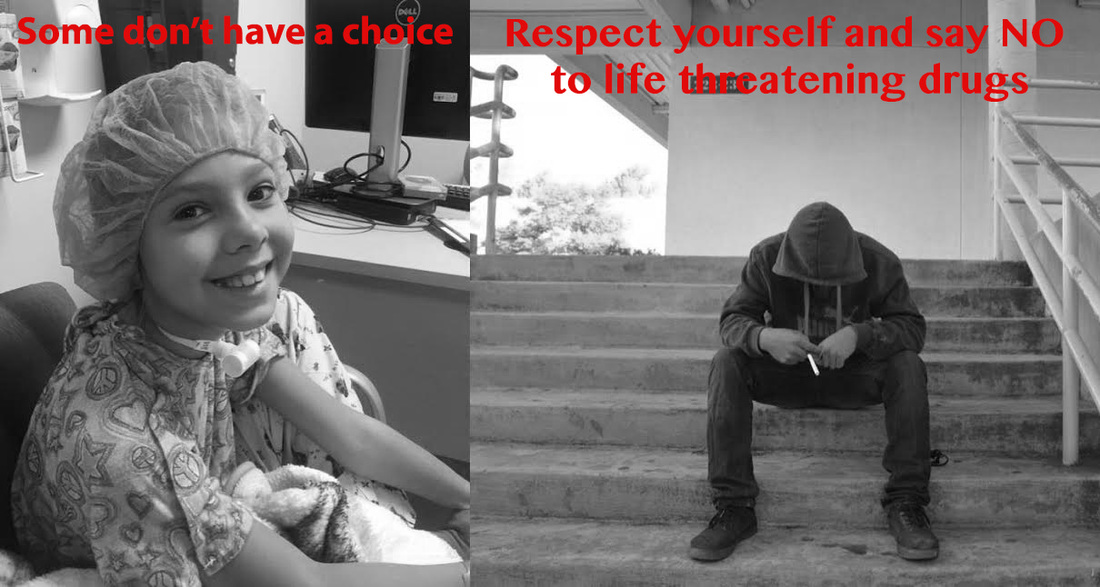 ISO: 200 f/8 Shutter Speed: 1/30 For my Respect Yourself photo I chose to capture the reality that smoking and other harmful drugs have on oneself. Many people take their health for granted, not noticing the harmful physical and psychological damage the toxin can have on someone. My sister Sophie faces an everyday breathing complication due to having a paralyzed vocal cord. With this comes a struggle to do basic activities. Although her medical history does not involve the influence of drugs, the solution to a stable childhood breathing pattern is the same to a person who has been influenced by drugs. She is faced with challenges that the normal being sees as child’s play. The realities of smoking are dangerous, including blackened lungs and cancer filled windpipes. Witnessing this, I wanted to display how people are buying their health away through drugs and taking for granted with what nature has given.
By placing the photos side-by-side I was able to display how smoking may seem as an innocent-rolled up-feel good paper, but causes more damage then thought of. My photo displays the “Respect Yourself” motto by showing how respecting yourself can lead to a happy, balanced, and healthy life. Smoking can cause a struggle to breathing and lead consumers to rely on a tracheotomy. By showing my sister with a tracheotomy, I was able to personally show that some do not have the choice of being dependent on breathing, so it is the audience’s responsibility to respect themselves in order to not face the health consequences of doing harmful drugs. 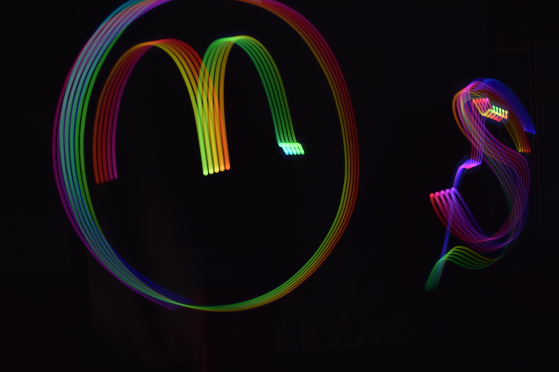 Shutter Speed: 8 ISO: 100 f/5.6 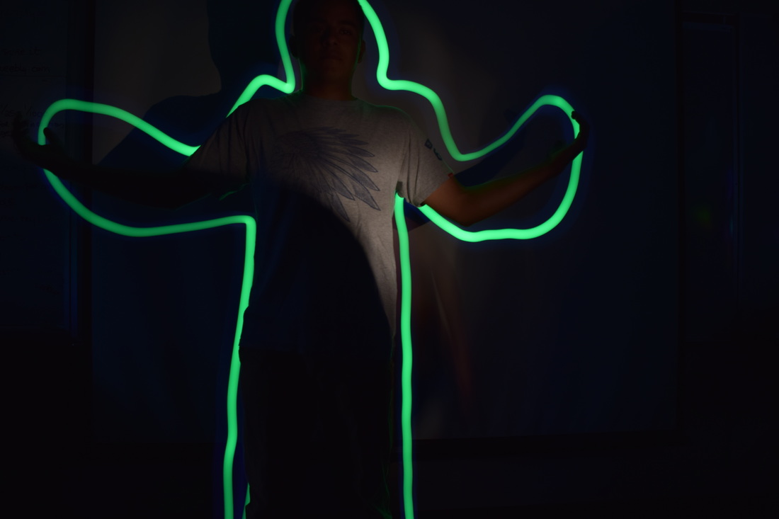 Shuttter Speed: 8 ISO: 100 f/5.6 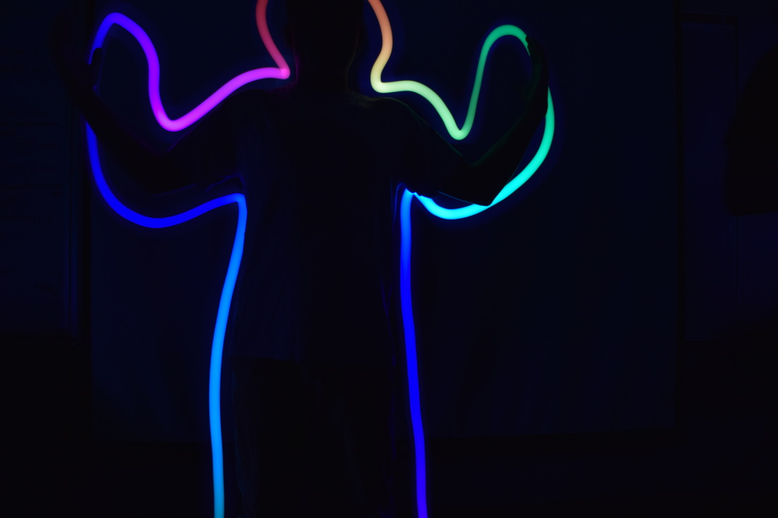 Shuttter Speed: 8 ISO: 100 f/5.6 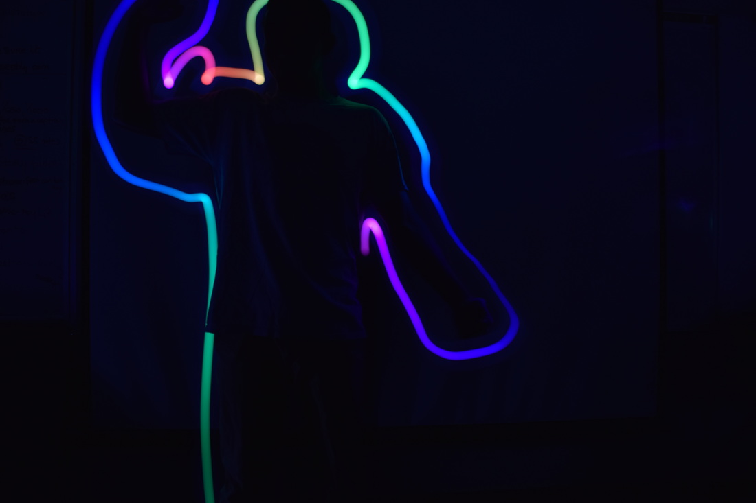 Shuttter Speed: 8 ISO: 100 f/5.6 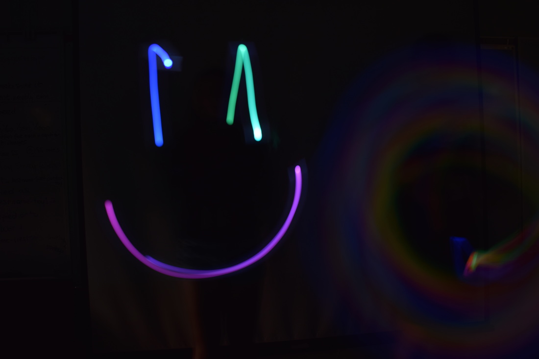 Shuttter Speed: 8 ISO: 100 f/5.6  Shuttter Speed: 8 ISO: 100 f/5.6 - I took the image on a tripod in the classroom. The classroom was completely dark with all of the lights off. Setting the shutter speed to 8 seconds allowed for a light painting to be captured by letting the light paint across the picture while the photo was being taken. I told my partner to create any shape he wanted and I was able to capture his light painting.
- Timing was one issue by wanted to create a picture, but going too fast before the time is up or taking too long to create the image. I had to time my shapes accordingly in order to have them stand out and be clear. 1. Timing is key to what you want to capture. 2. Using a tripod is needed in order to create a steady surface for the painting to be photographed. 3. Flash can not only be used to give light, but as well as embellish a certain figure/object in an image. - Creating graffiti murals without having to physically use spray paint gives way to the same image to be made. This shows that light painting can use the same piece of art but in a different media. By using light painting, one is able to make their art be brighter and/or grab the attention of a bystander. |
AuthorMaddy Cuppett, an exploring, excited photography student in the learning. Archives
June 2017
Categories |
 RSS Feed
