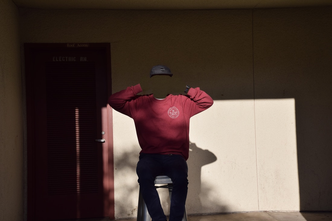
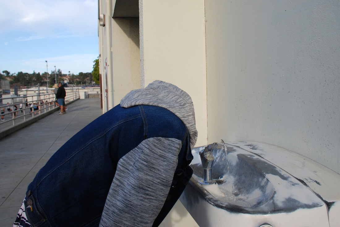
Framing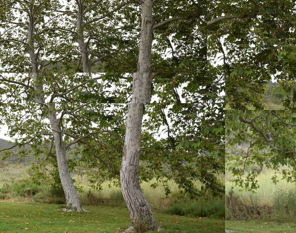 Rule of Thirds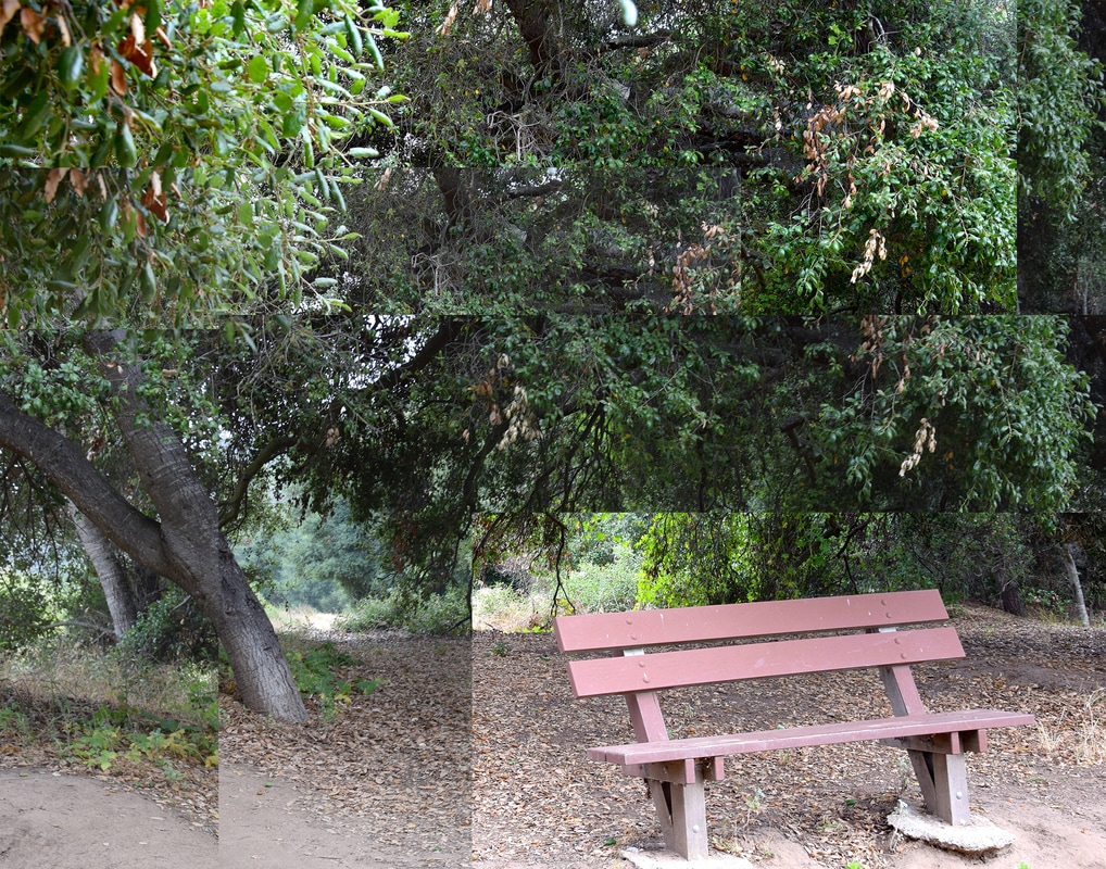 David Hockney was born in Bradford, England in 1936. Hockney attended art school before loving to Los Angeles in 1960. There began painting his famous pool paintings. In 1970, he began photography and enjoyed making photo collages, which he called "joiners". He is still very active in the art community and was voted the most influential British artist of the 20th century. My artwork emulates his style in the way that I used multiple images to create a cohesive piece, even if the images don't lie up exactly to the original photo.
I created the collage by taking photos of one area with differing angles. I took an image of the whole picture, and then went from top left-top right, middle left-middle right, and finally bottom left-bottom right. I did this by knowing what compositional rule I wanted to do, and then found a subject that showed the rule (in this case I did framing and rule of thirds). I created the collage using photoshop. In Photoshop, I opened file-new and made sure the dimensions were 11x14 with a 300 resolution. Using the move tool, I dragged the image I wanted to add into the Photoshop icon. I cropped the image to make it smaller so I could create my collage. I repeated this step with all the images I used, changing the image sizes, in order to create my collage. Once I was happy with the way my images were positioned, I merged the layers and saved the file. 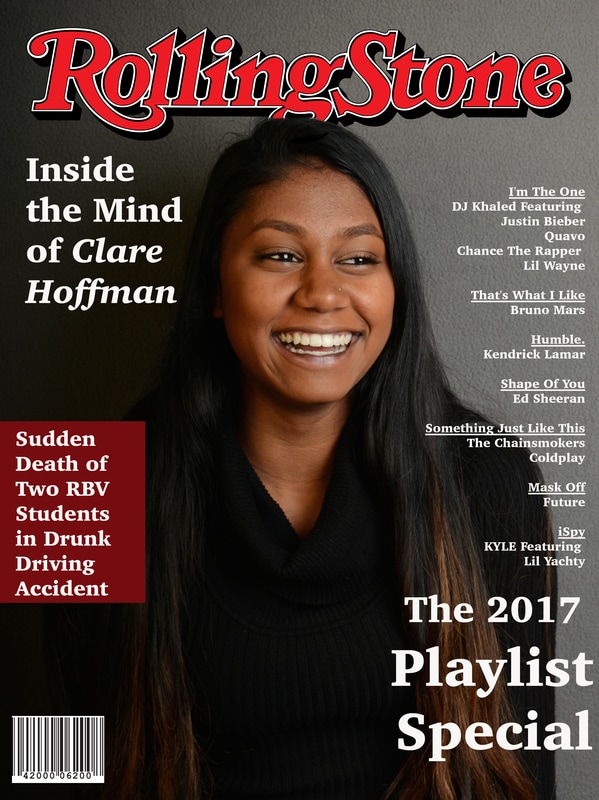 I chose to do Rolling Stone magazine because I'm very fascinated with their work and enjoy the truth that their articles bring out of people. It is a common magazine that artists respect and often share their personal stories to the company. Often, Rolling Stone magazine chooses images that lead to what the story of the artist is about. For my photo, I wanted to show how Clare is a very nice and always happy person, so when I took the photo of her smiling and changed it to black and white, her smile stood out greatly.
The covers are also commonly close to the person's face, so I did this by taking a picture close to her upper body. For the name of the magazine I used a label I found on google, but in Photoshop I chose the font I used because it was very similar to the one they use in their magazines and also made the picture look to be in a different time era with the swirly letters. I chose white font because I wanted the main focal point to be Clare. I created the image by having Clare sit on a stool and laugh. I used the grey backdrop as my background. A strobe light is a light that is used to produce regular flashes of light. I used tis through a cord that connected to my camera to the lights, and when i clicked to take a picture (pressed on the shutter), the light would trigger. I usd this when I wanted an image with lighting in a certain place in my picture. Modeling light is a light built into a flash unit that remains on while the flash is turned on when the photographer isn't taking a photo, allowing the photographer to assess highlight and shadow areas that will be made when exposing the subject to the brighter light of the flash.A softbox is a light modifier. A softbox diffuses the light into a pleasing soft, even light, so harsh shadows won't be so harsh. I would use a soft box when I want to emulate window light. A reflector is a piece of reflective material to bounce light in a certain direction. This is used to distribute light where it is not naturally or originally placed. You use it by capturing the light onto the material and moving the reflector in the direction of the subject so the light bounces in that direction. A grey card is a card with grey, black, and white colors on it. It is used to find the correct exposure for an image. A radio trigger is a small radio unit normally mounted on the camera hot shoe. A small receiver unit is also mounted on the off-camera flash. The radio trigger saves having the camera and flash connected by long wires. I would use it to have full mobility when taking a picture and to not worry about tripping over/ destroying cords.  The name of my piece is “Irony”. In today’s society, the controversy between borders, gender roles, and political socialization has a vast control over America’s media outlets and is exposing the youth to democracy at a monumental rate. I chose to directly challenge the political wave through my digital photo composite image. I chose the name Irony in the way that my image embodies the union between countries with a sign that displays “welcome” in Spanish; however, while many Americans are given the pleasure to come to Mexico, the gesture is not always returned. Many Americans enter the Spanish territory in hopes for relaxation and a neighboring vacation, but when the people of Mexico choose to come to America for the “American dream”, they are scrutinized and automatically given the identification of rapists, thieves, and people willing to “cheat the system”. I took the images that I used for my piece at a local park named the Duck Pond. I used leading line with the rocks to specifically show that there is a way to the union between countries, if people are willing to be welcoming to others. I used a Nikon D5300 with a 18- 140mm lens to take images that I later used as building blocks for the final work. I used Photoshop and iPhoto to manipulate and create my compositional image. Using multiple layers and alterations such as hue saturation layers and level/curve adjustments, I was able to easily identify the meaning behind my work. I added an ocean in the middle of a road to show how countries are connected through bodies of water and used a hue saturation of a blue tint to create harmony within my image. This helped the sky and the ocean balance each other out by adding a similar blue shade over the entire image. My photo is specifically under digital photo composite image due to my final image withholding different pictures and showing an underlying meaning to the final construction. When I was completed with my final piece, I printed it using Epson Glossy Photo Paper and with an Epson P800 digital printer.
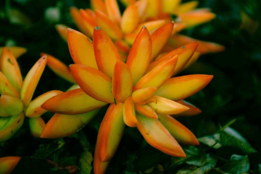
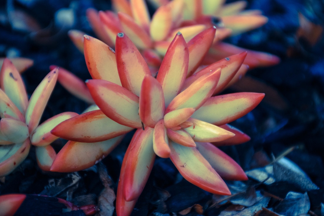
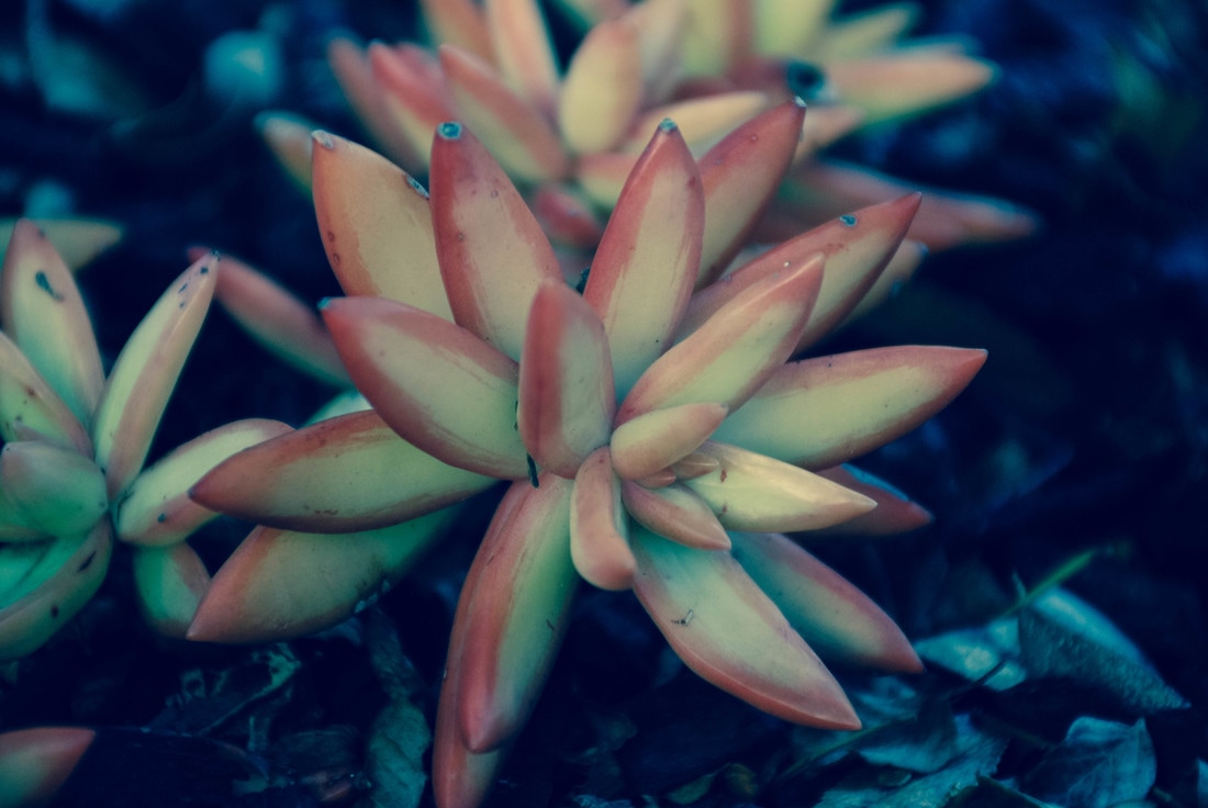
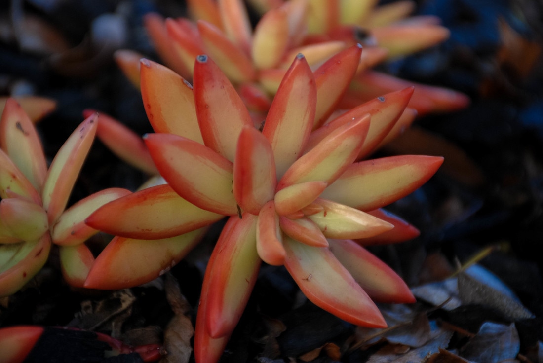
 ISO 400 f/8 Shutter Speed: 1/750  ISO 400 f/9.5 Shutter Speed: 1/750  ISO 400 f/9.5 Shutter Speed: 1/750  ISO 400 f/8 Shutter Speed: 1/750  ISO 400 f/9.5 Shutter Speed: 1/750 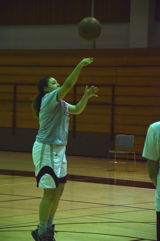 ISO 2500 f/5.6 Shutter Speed: 1/250 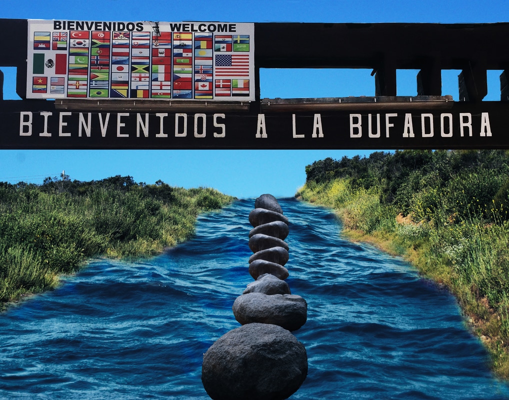 "Imagine"-John Lennon
Imagine there's no countries It isn't hard to do Nothing to kill or die for And no religion too Imagine all the people living life in peace, you You may say I'm a dreamer But I'm not the only one I hope some day you'll join us And the world will be as one I chose this song to embody my image because the song shows the opportunity of peace without any countries, but in my image, there is a sign that says "welcome" with multiple flags. In today's society, it is very easy for Americans to go into Mexico without harassment or struggles, but for the people of Mexico to come into America, harassment is found often. I emulated Erik Johansson in the way my image used realistic aspects without looking realistic. I chose to use the ocean as a way to show that all countries/cultures connect through bodies of water. What I did in photoshop to create my image was I first created the ocean image as my background. I found the ocean image using an advanced image search. Specifically large and with a resolution of 300. I then added the two dirt roads to create a pathway. I merged the two pathway layers to make a distinct guide for the ocean to be shown. I then used a layer mask to reveal the ocean layer using the brush tool. I added a hue saturation of a blue tint to create harmony within my image. This helped the sky and the ocean balance each other out by adding a similar blue shade over the entire image. I then placed my sign image into the Photoshop file by dragging the image to the Photoshop icon. I cropped my sign image to only reveal the sign portion and not the entire structure holding the sign up. A layer mask allowed for the sign to only be shown instead of the sky that was already behind it. This way the sky background in my composite would be shown through the gaps in the sign. I then used a level adjustment layer to bring color to the highlights and shadows. I did this by changing the RGB levels to change the amount of black that is in my photo. This way, my darkest points in my image will either be blue (in the ocean) or green (in the grass). I added a curves adjustment layer to darken the ocean so the ocean and sky could contrast a little more. I didn't want the sky and ocean to resemble too much in shades of blue, so the curves allowed for the ocean to darken in contrast to the sky. I lastly added rocks to form a leading line in my image. I did this by moving an image of rocks to the Photoshop icon and used the quick selection tool to pick the rocks that I wanted to use. Then with the move tool, I moved the rocks to my composite. When I began to place the rocks I noticed that they were different in how the sun shone on them, so in order to fix this I added a different rock image. To add the new rocks I used the same steps that i used to add the first set of rocks. I wanted to change the size of the rocks so I used edit-transform-scale. I then aligned the rocks to form leading line and changed the brightness of the rocks (image-adjustment-brightness/contrast) to make to sun have the same exposure as its surroundings (the sun above everything). I ran out of rocks to create the length of line that I wanted, so I duplicated one of the rock layers and flipped it horizontal to change the angle (edit-transform-flip horizontal). I moved all of the rocks into alignment and made sure the lighting was uniform. After that I finalized the picture by merging the layers. 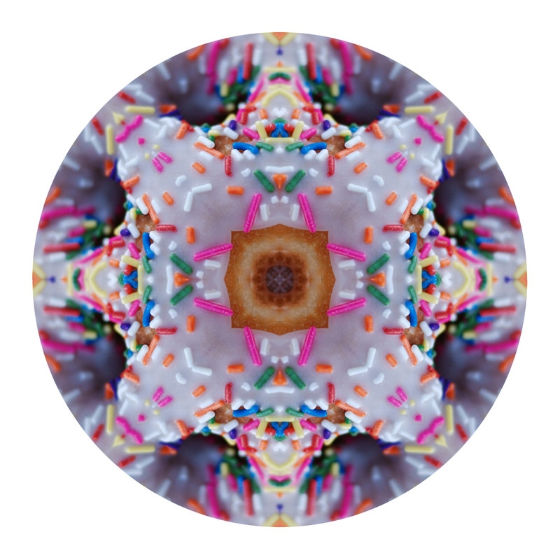 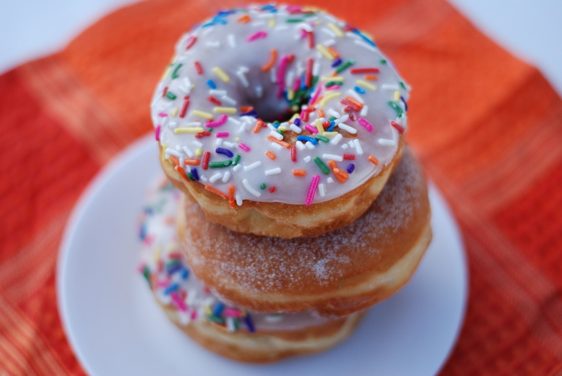 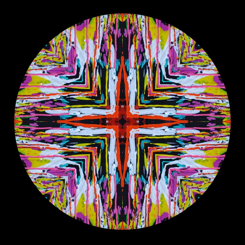  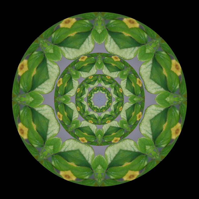  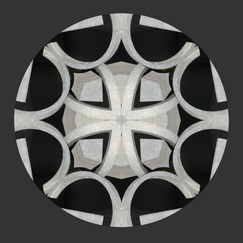 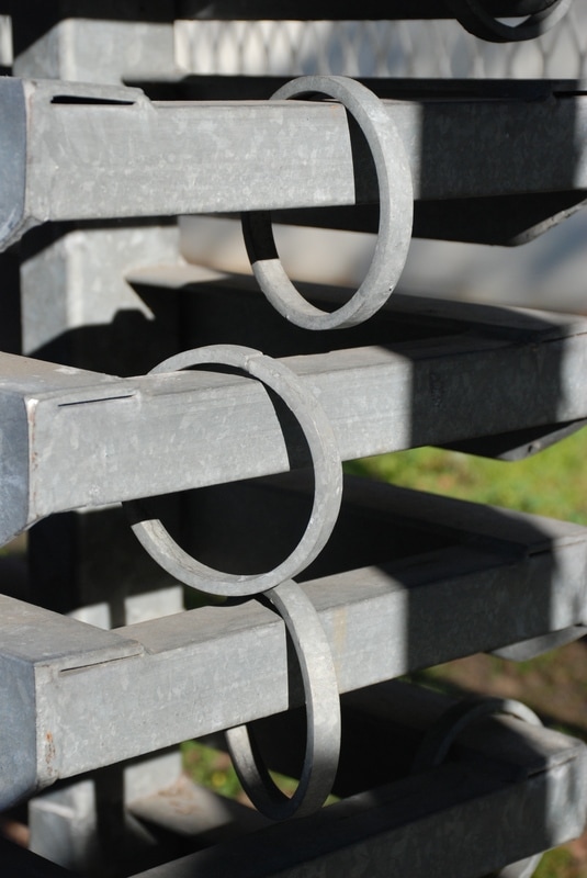 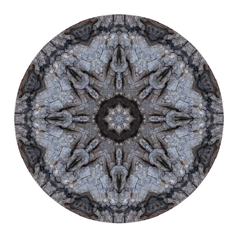 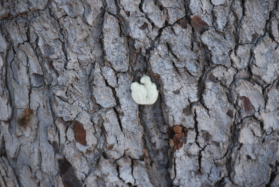 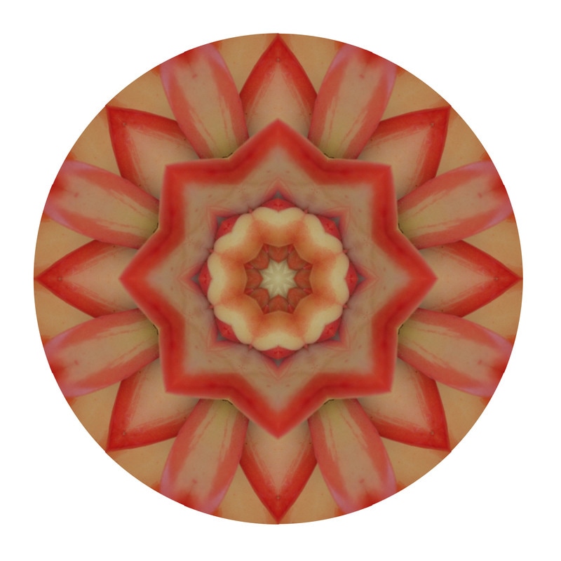  A mandala is an image that includes the repetition of geometric shapes, usually in a circular form. I created my mandals through Photoshop by using images that I took during class. The first step I took to create my mandala was finding an image that I wanted to use and finding the template that would help me shape my image and dragged both to the Photoshop icon. I then used the move tool to grab the tab of the photo I wanted to use and dragged it out of the Photoshop frame. Using the magic wand tool, I clicked on the triangle I wanted to use, and moved it to the image I was going to cut. I then found a part of the image that would be interesting in a mandla, then pressed Command-C to copy the spot. I then went back to my template and pressed Command-V to paste the cut image. I dragged the image tab back into the Photoshop frame and began my mandala pattern. I first duplicated the first layer using Command-J and with the duplicated layer I did Edit-Transform-Flip horizontal. I then did Edit-Transform-Rotate to the same layer. I rotated the image to around -135 and clicked check when it aligned with the triangle. I aligned both of the layers up to fit inside of the triangle template and when they did not align perfectly, I used the arrow keys to move the layers closer. When I was satisfied with how it looked, I pressed Command-Click to select the two layers, then I pressed Command-E to merge the two layers. With the new layer (including the first two layers), I duplicated the layer and then did Edit-Transform-Flip Horizontal. I aligned the two layers and used the arrow keys to make the madala perfect. I merged the two layers and was now finished with half of my mandala. I then duplicated the new layer and flipped the duplicated layer vertically. I aligned the two layers and was almost finished with my mandla. I used the purple lines to adjust the mandala to create a perfect circle and deleted the template background. I saved my mandala to my desktop and to the common drive. I liked creating the mandalas due to ending with an image that was completely different from the original picture. My favorite image was the image of the leaf. I first struggled with making the triangles line up perfectly to fit inside of the triangle, but by using the arrow keys, I was able to solve this problem. If I had to do it over again, I would choose different elements to take pictures of and include more detail in my images.
|
AuthorMaddy Cuppett, an exploring, excited photography student in the learning. Archives
June 2017
Categories |


 RSS Feed
