 "Imagine"-John Lennon
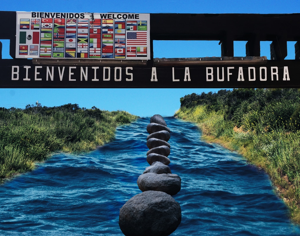
Imagine there's no countries It isn't hard to do Nothing to kill or die for And no religion too Imagine all the people living life in peace, you You may say I'm a dreamer But I'm not the only one I hope some day you'll join us And the world will be as one I chose this song to embody my image because the song shows the opportunity of peace without any countries, but in my image, there is a sign that says "welcome" with multiple flags. In today's society, it is very easy for Americans to go into Mexico without harassment or struggles, but for the people of Mexico to come into America, harassment is found often. I emulated Erik Johansson in the way my image used realistic aspects without looking realistic. I chose to use the ocean as a way to show that all countries/cultures connect through bodies of water. What I did in photoshop to create my image was I first created the ocean image as my background. I found the ocean image using an advanced image search. Specifically large and with a resolution of 300. I then added the two dirt roads to create a pathway. I merged the two pathway layers to make a distinct guide for the ocean to be shown. I then used a layer mask to reveal the ocean layer using the brush tool. I added a hue saturation of a blue tint to create harmony within my image. This helped the sky and the ocean balance each other out by adding a similar blue shade over the entire image. I then placed my sign image into the Photoshop file by dragging the image to the Photoshop icon. I cropped my sign image to only reveal the sign portion and not the entire structure holding the sign up. A layer mask allowed for the sign to only be shown instead of the sky that was already behind it. This way the sky background in my composite would be shown through the gaps in the sign. I then used a level adjustment layer to bring color to the highlights and shadows. I did this by changing the RGB levels to change the amount of black that is in my photo. This way, my darkest points in my image will either be blue (in the ocean) or green (in the grass). I added a curves adjustment layer to darken the ocean so the ocean and sky could contrast a little more. I didn't want the sky and ocean to resemble too much in shades of blue, so the curves allowed for the ocean to darken in contrast to the sky. I lastly added rocks to form a leading line in my image. I did this by moving an image of rocks to the Photoshop icon and used the quick selection tool to pick the rocks that I wanted to use. Then with the move tool, I moved the rocks to my composite. When I began to place the rocks I noticed that they were different in how the sun shone on them, so in order to fix this I added a different rock image. To add the new rocks I used the same steps that i used to add the first set of rocks. I wanted to change the size of the rocks so I used edit-transform-scale. I then aligned the rocks to form leading line and changed the brightness of the rocks (image-adjustment-brightness/contrast) to make to sun have the same exposure as its surroundings (the sun above everything). I ran out of rocks to create the length of line that I wanted, so I duplicated one of the rock layers and flipped it horizontal to change the angle (edit-transform-flip horizontal). I moved all of the rocks into alignment and made sure the lighting was uniform. After that I finalized the picture by merging the layers.
0 Comments
Leave a Reply. |
AuthorMaddy Cuppett, an exploring, excited photography student in the learning. Archives
June 2017
Categories |
 RSS Feed
