One Inch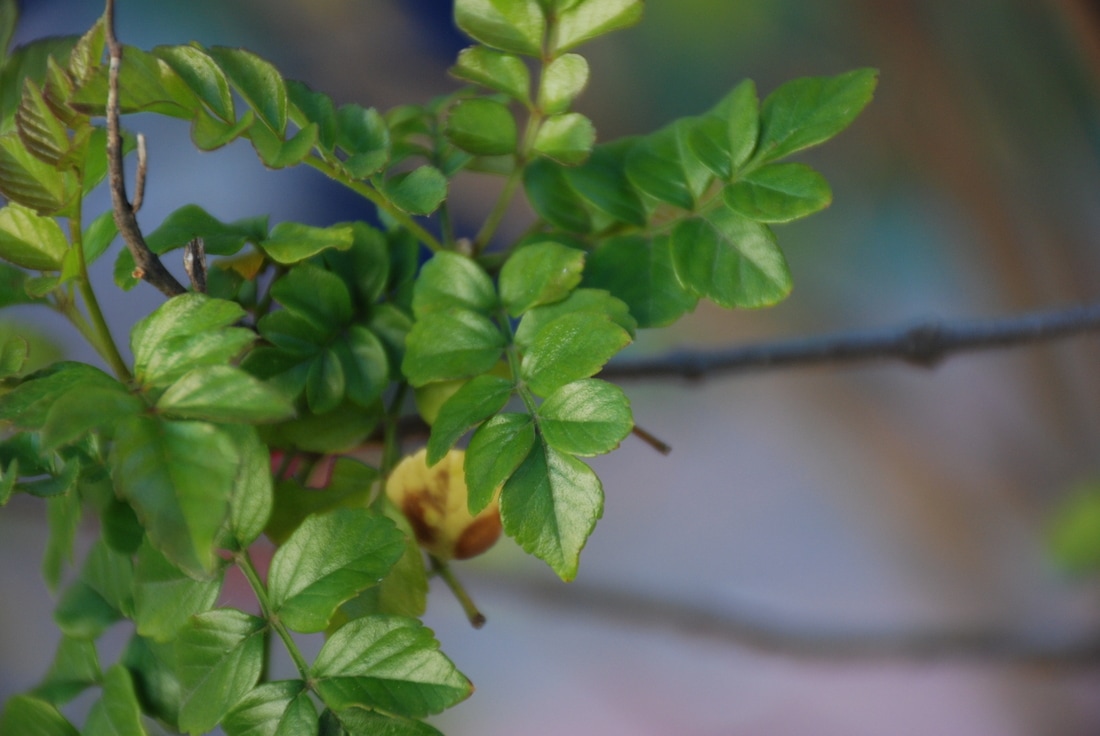 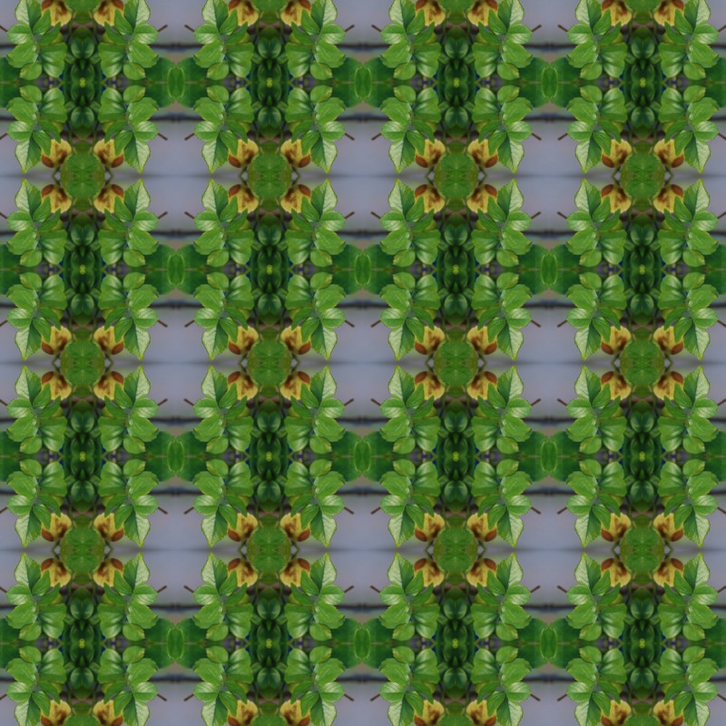 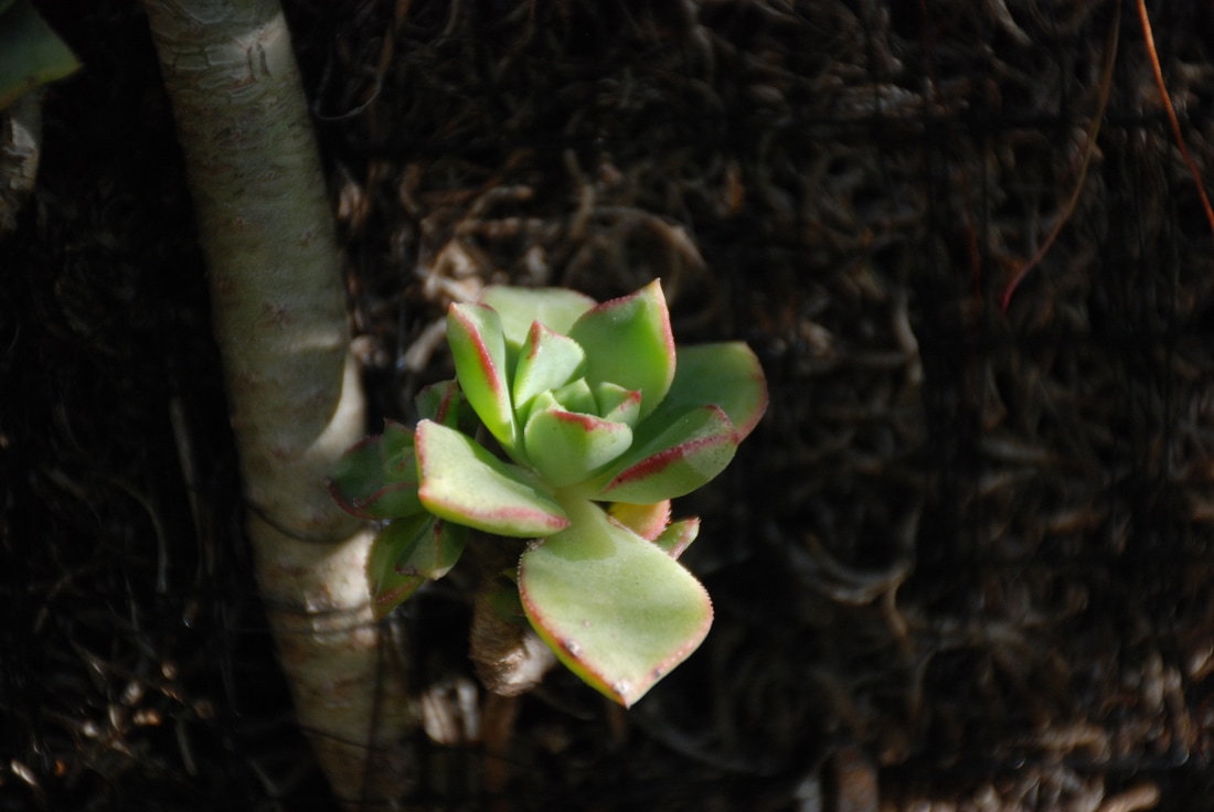 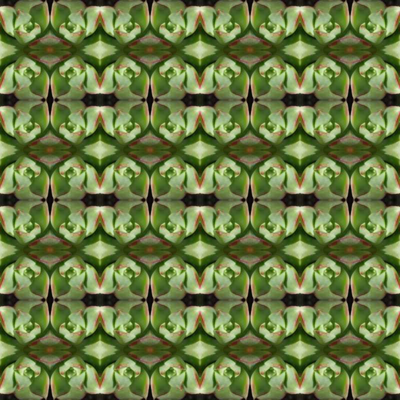 Two Inch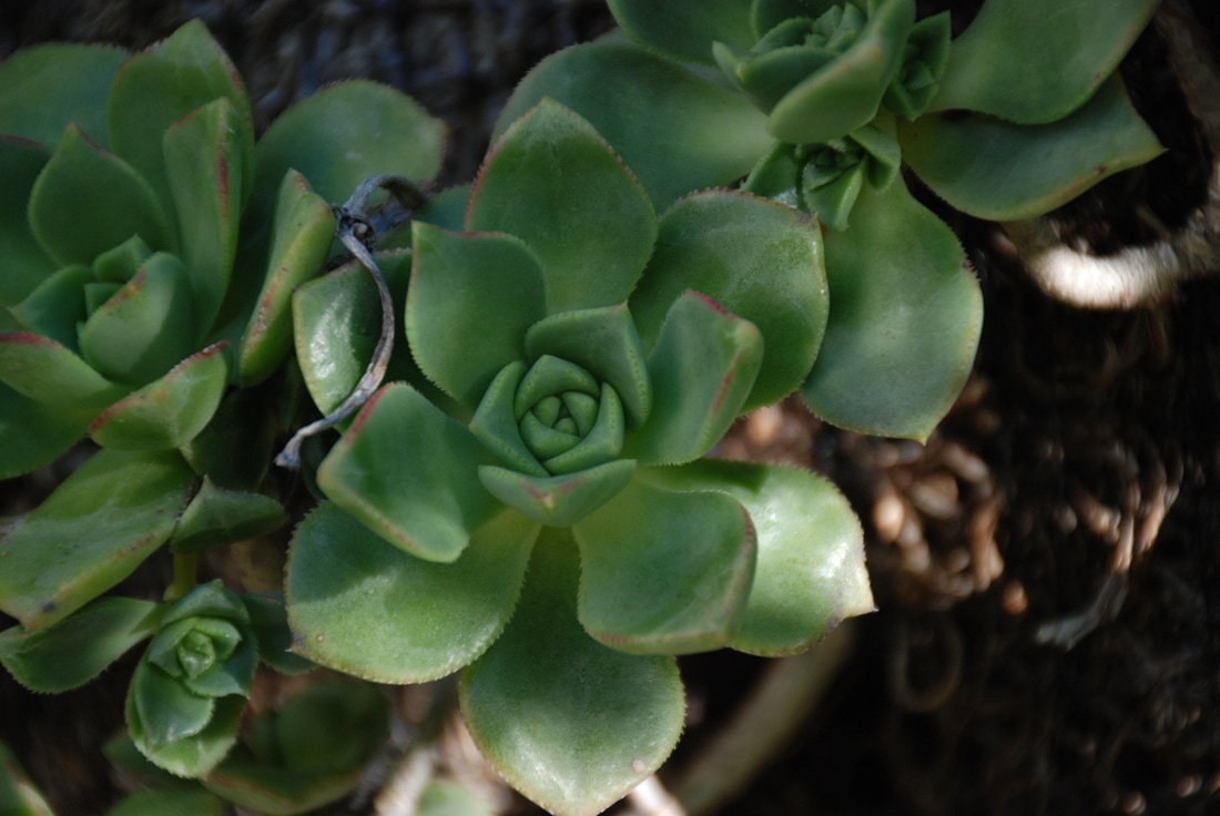 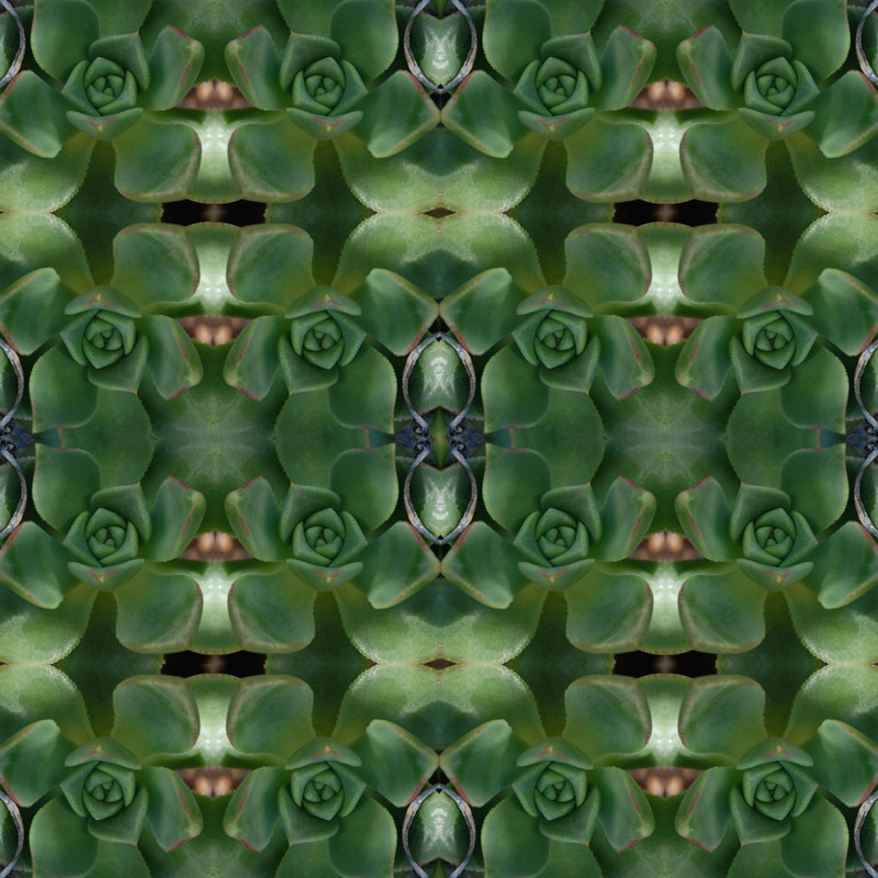 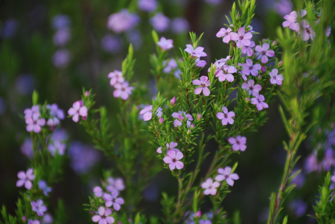 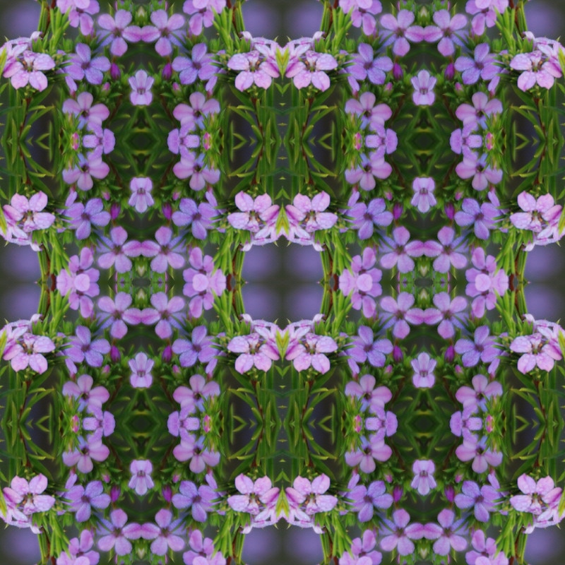 Four Inch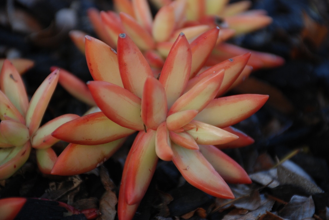 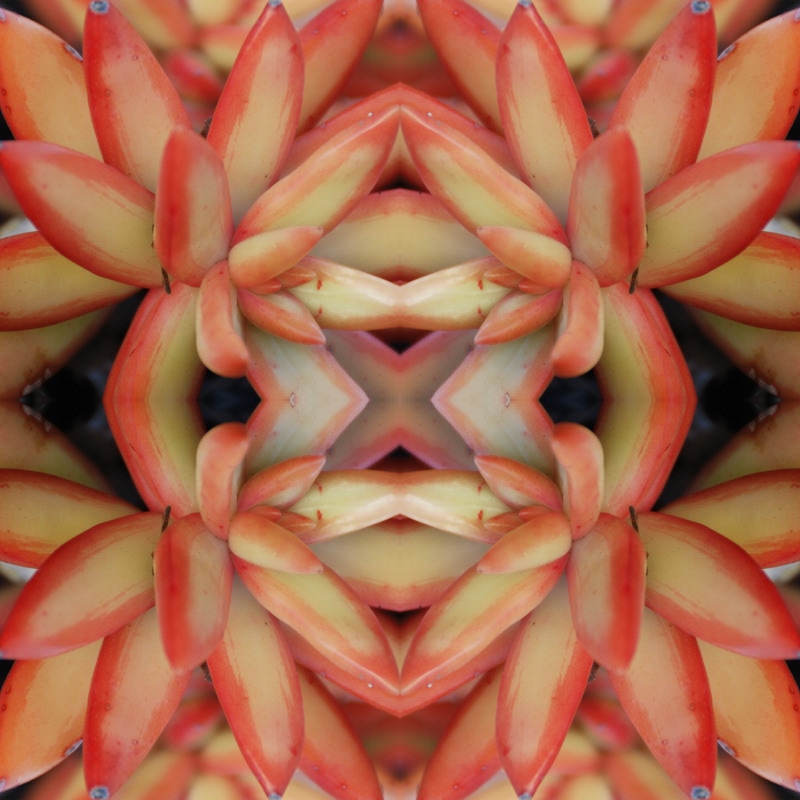 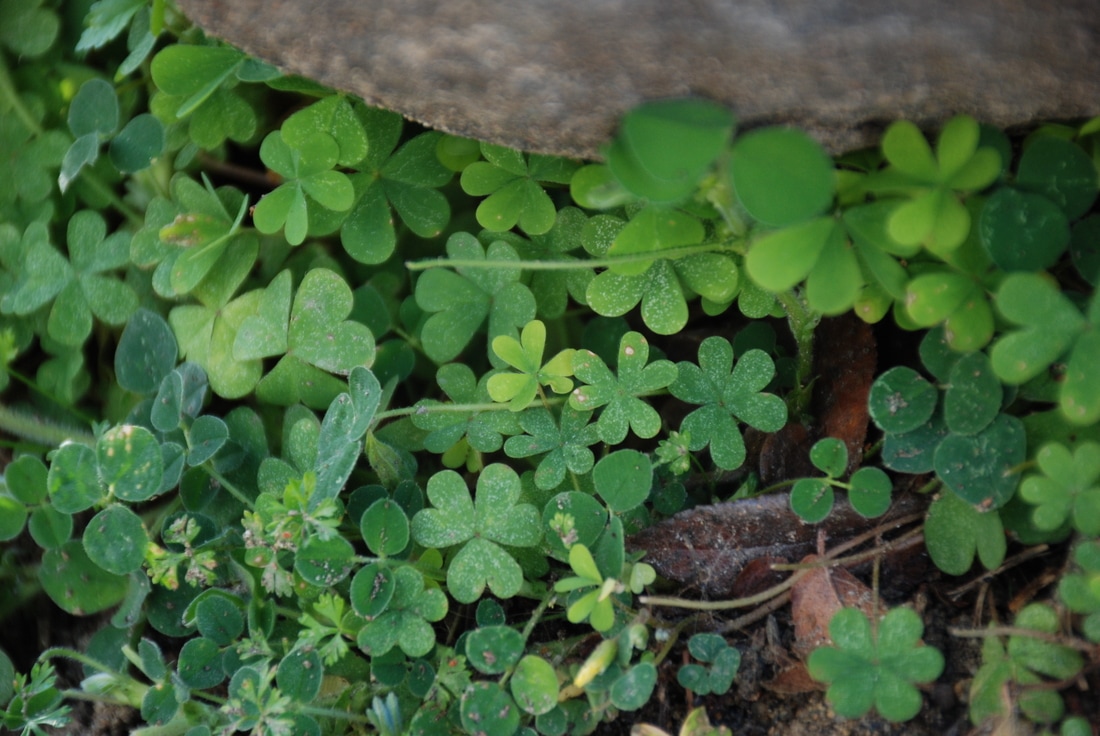 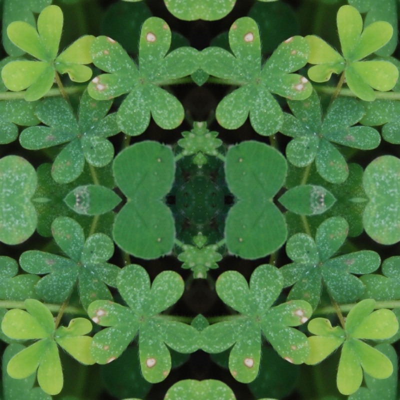 A tessellation is an image made of shapes that are tightly placed next to one another, in which a pattern is made without any empty space showing. I created my tessellation through photoshop and used micro images that I took of flowers and other plants. In order to create the tessellation I had to first make a template in which I could place the cropped image to fit in the 8 inch frame. I created this by going to file-new. I then used the ruler tool to make the guides for the image placement. I used the ruler by going to view-ruler. Once that was turned on, I used the move tool to place the guides in a horizontal and vertical manner to create the box shapes. When the guides did not place to the exact increment I wanted, I went to view-new guide and put the inch value and put horizontal or vertical and then pressed enter. Once I finished the template, I moved on to cropping the image that I wanted to use. I dragged my photo to the Photoshop icon, which popped up in photoshop as a new file. I then used the crop tool to crop the part of the image that I wanted to use. I made sure the image was going to be 1:1 square shape. After I found the part of the image I wanted, I pressed the check mark, and then I changed the image size to fit the template. For instance, for the four inch template, I changed the image size to 4"x4" so the picture could fit in the guides. I then dragged the top of the tab of the cropped image over to the template. Using the move tool, I moved the image to the top left box. I then went to layer-duplicate layer. I moved the duplicated layer to the top right and went to edit-transform-flip horizontal. I then made sure the image was in the right spot by using the purple guide lines. I then duplicated the top left image again and moved it to the bottom right of the template. I went to edit-transform-flip vertical. I repeated both of these steps for the bottom right. I duplicated the top left image, moved it to the bottom right, went to edit-transform-flip horizontal, then flipped vertical. I then moved the guides to made sure there was not white showing, once I saw that the image was a tessellation, I cleared the guides, merged the layers using layer-merge visible, and saved the image to my desktop and common drive. I liked the tessellations because I was unsure what the image would end up looking like, until the end of the tessellation process. My favorite image was my four inch tessellation of the orange flower. My favorite color is orange so I liked how the vibrant colors played off of one another as they were reflective. At first I struggled with making sure the image was following the guides, but after using the purple lines and understanding them, I got the hang of not having white gaps in my photo. If I had to do this project again, I would take images at different angles to really get a tessellation that looked cool. An image that once placed in a tessellation form, would be hard to recognize what the image was originally.
0 Comments
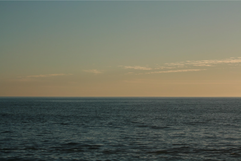
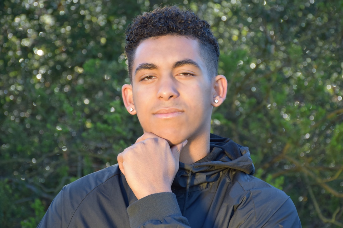 ISO: 400 f/8 Shutter Speed: 1/250 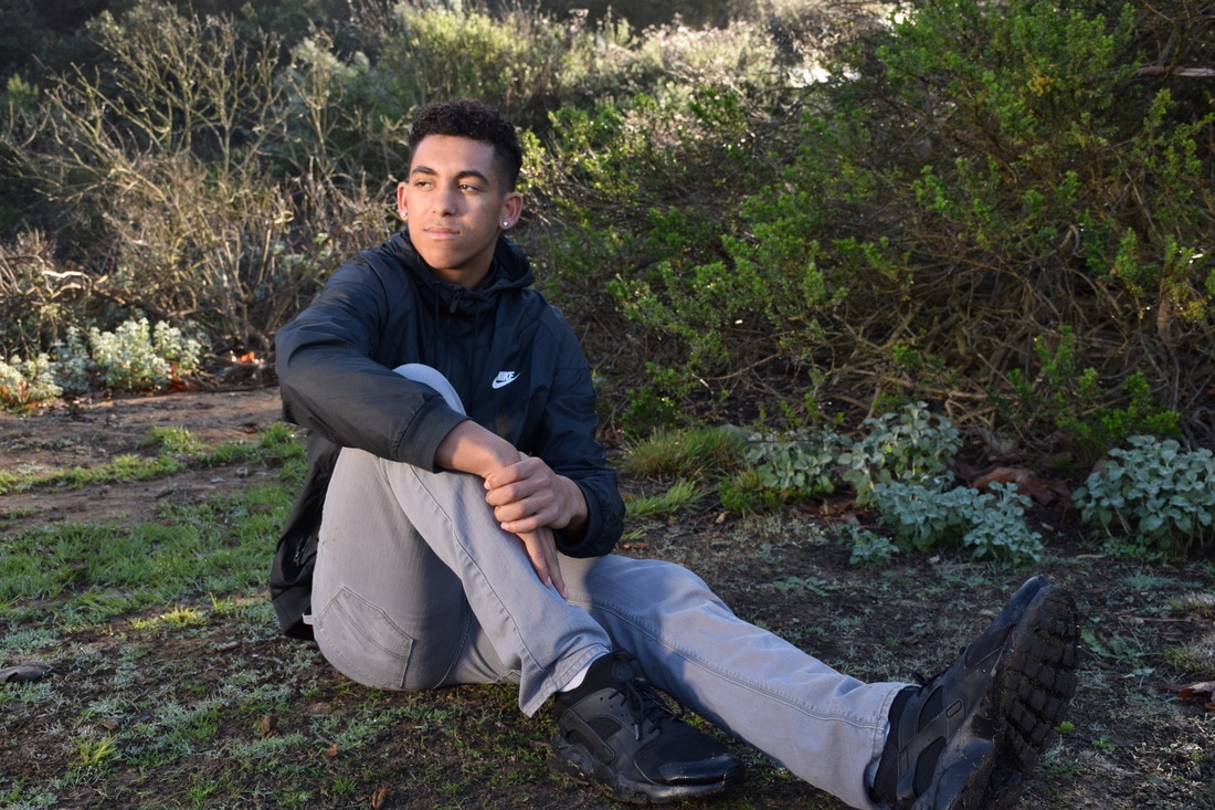 ISO: 400 f/8 Shutter Speed: 1/180 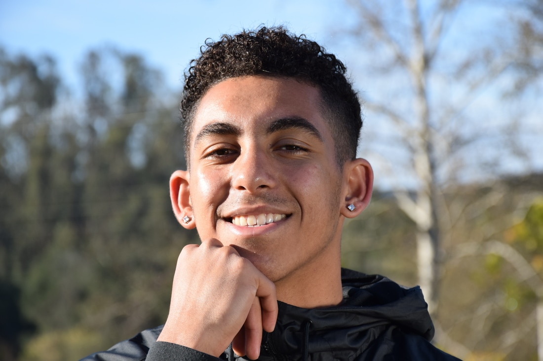 ISO: 400 f/8 Shutter Speed: 1/750 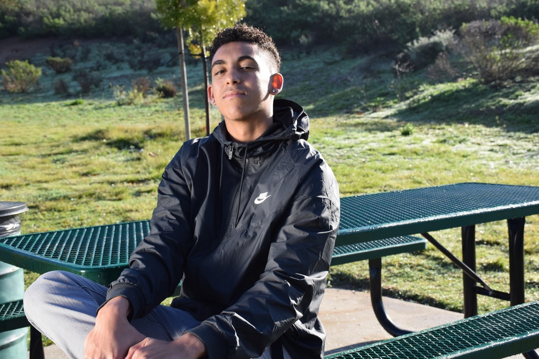 ISO: 400 f/8 Shutter Speed: 1/500 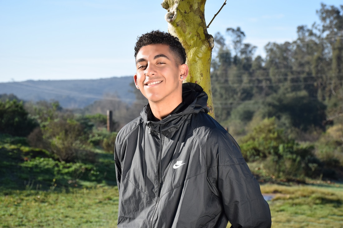 ISO: 400 f/8 Shutter Speed: 1/1000 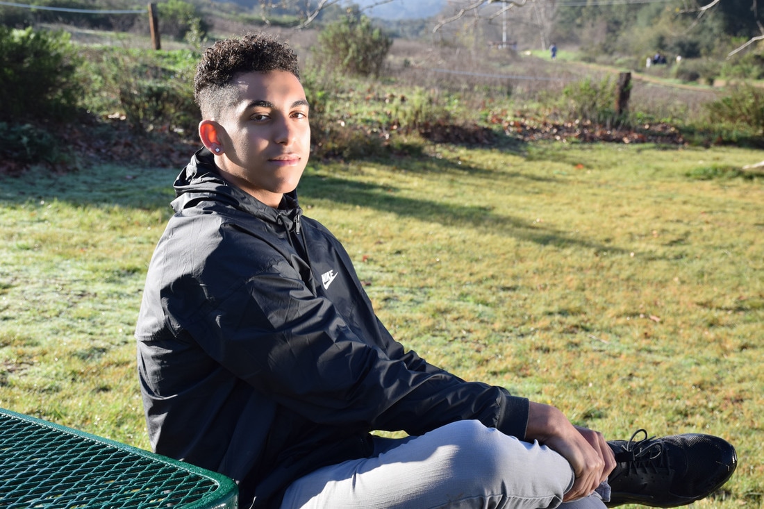 ISO: 400 f/8 Shutter Speed: 1/500 After going to the duck pond, I learned that lighting can really have an impact on the subject in a photo. With the right lighting, different moods can be brought about and can change how the audience views the image. We used a shot list to decide on which poses each person should do. Trey preferred the more serious poses, so we decided to shoot him doing those. I liked how each pose showed a different side of Trey. One where he is relaxed, another where he is serious, and the other is of him smiling. The poses allowed for each person to show different emotion, along with different amounts of body exposure. The reflector also allowed for the mood to alter. I liked the reflector because it allowed for the image to have really nice lighting in dark places, such as under a tree or under shade. The reflector allowed for my group to use light to brighten up the subject and give a nice color to the subject's skin tone. I retouched Trey's skin a little bit due to having facial hair and an uneven skin tone. I did this by using the surface blur edit to make his skin more smooth, but I also added noise to not make Trey look unrealistic. I set the noise at 2.5 for the images. Positions include fist under the chin, back and back leg up against a tree, and a head half turned looking over their shoulder. Some careers that use portrait photography are wedding photographers, commercial photographers for makeup or skin products, and studio photographers. Large companies will hire portrait photographers for advertisement and some families will hire for wedding portraits. Whether a large corporation for advertisement or a small town family for home pictures, anyone and everyone can hire a portrait photographer. Professional Portrait Photographers tend to make between $75-$250 an hour.
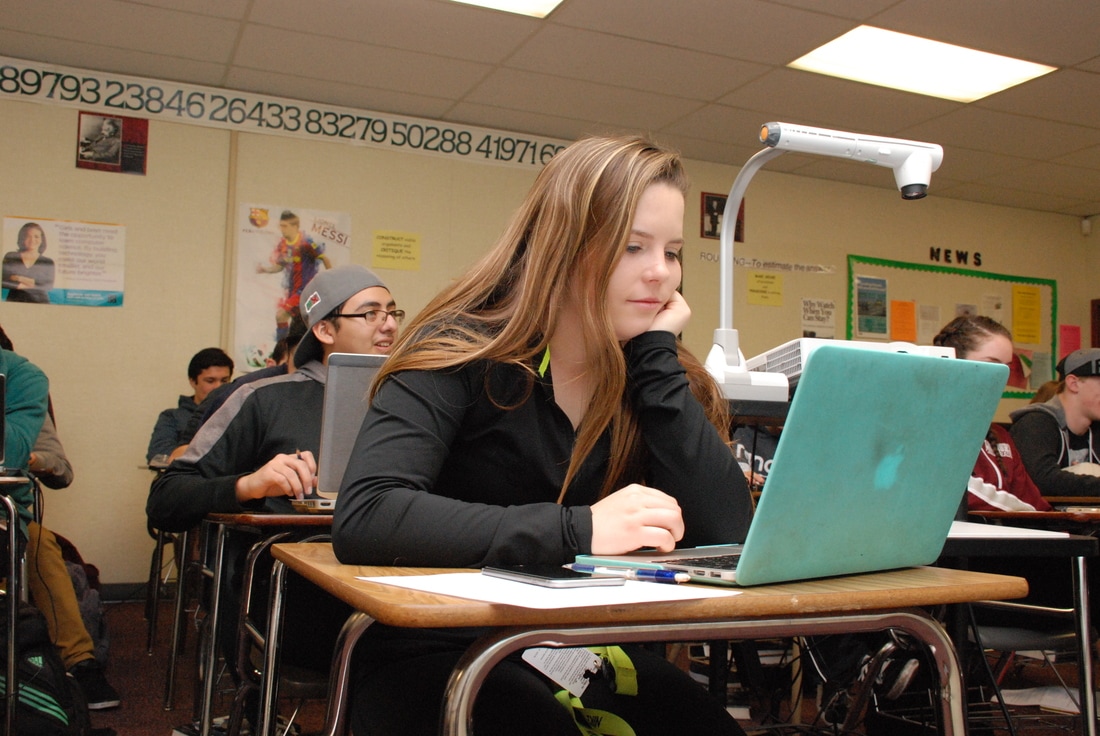 ISO: 1600 f/8 Shutter Speed: 1/60 Education has found barriers through every recipient of knowledge in today’s society. Throughout history, women have been challenged with the ideology that men withhold a natural given grasp on intellectual content, when in reality, women have put an end to obstacles that stand in their way. Education is for all, and should be practiced as so. With technological advances becoming embedded in everyday usage, young men and women should be given the opportunity to assimilate to the new cultural norm. I chose this photograph of a girl using a computer due to her challenging the predominantly male field of computer science. Education is blind, and does not recognize race, gender, age, or sexuality, which are many of the contributions that restrict some from equal education. The girl personifies diversity in the educational environment and explores what it looks like to achieve academic intentions. Symbolizing the movement in current culture, the image of the girl puts forth a realization to what embodies education, equality.
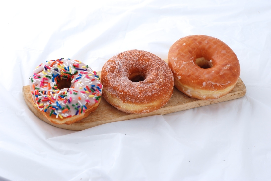 Iso: 400 f/8 Shutter speed: 1/1000 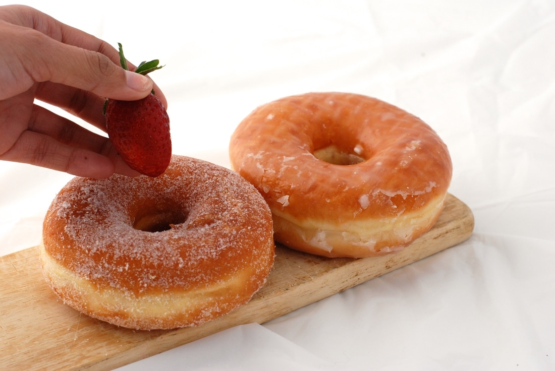 Iso: 400 f/8 Shutter speed: 1/750 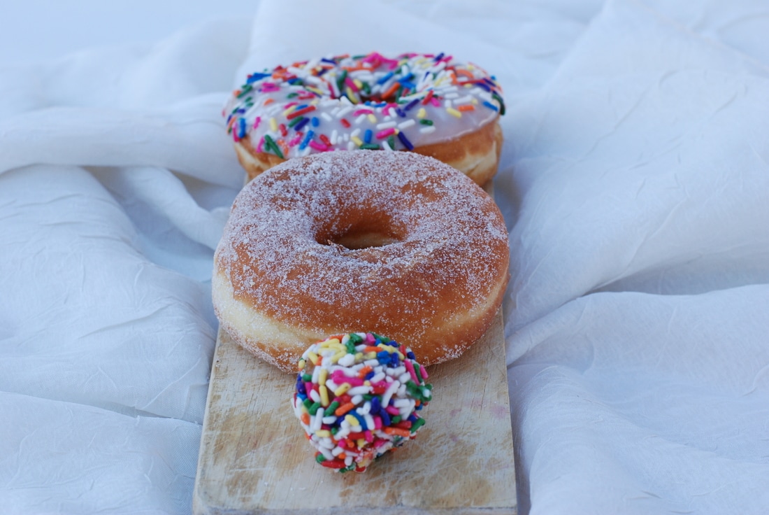 Iso: 400 f/8 Shutter speed: 1/250 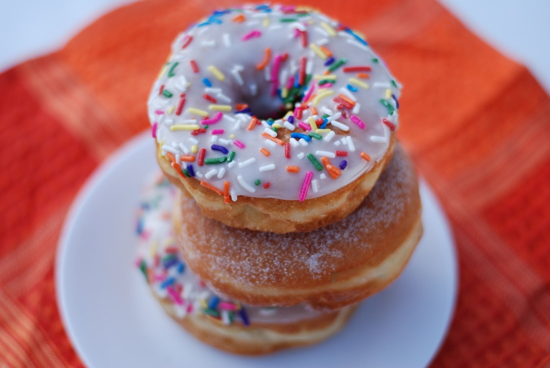 Iso: 400 f/1.8 Shutter speed: 1/2000  Iso: 400 f/1.8 Shutter speed: 1/3000 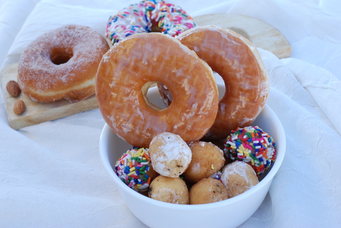 Iso: 400 f/8 Shutter speed: 1/90 For my food I brought in donuts. I thought this was a fun and colorful way to take pictures of food. Along with bringing in donuts, I also brought a plate/bowl and used one of Mrs. Moncure's wood boards for my background. I used these objects to change the angles of the donuts and make each pose different. The five things that I learned from food photography was point of view helps create a story, one wants to be more graphical than emotional with the point of view, details are important to help explain the story, especially in the background, the best props come from home, helps to create an authentic feel, and work with the color palette and use color harmony/color value. I replicated another artist through getting close up to the food, and showing as much detail as possible. This helped create a detailed look with the background showing a natural environment, where the food would be usually seen. Three things that I learned when taking the photographs was lighting is especially helpful to create the mood, not only to make the image lighter. Also, placement of the food can create an image that shows a much different feel when the angles differ consistently and adding objects to the background gives way to an image having a strong focal point, without being the only object in the image itself. Some careers that include food photography are food advertising, food inspectors, and food bloggers. Many businesses that want to emphasize the look of the food they are selling, use food photography. Such as restaurants, grocery stores, etc.... I think I was successful with the placement of the food. I think I put in a lot of effort to change the angles of the donuts in order to create multiple moods. I changed the lighting often in order to give different point of views of the donuts, as well as show how lighting can effect the way an object is shown.
 The steps I used in Photoshop to create the image is I first cropped and changed the color of the images in iPhoto. This later helped me figure out the correct sizing of the letters in the frame without the images looking squished. The first thing I did in Photoshop was I picked out the correct template according to how many letters there are in my name. I chose the template name 5 and dragged this to the Photoshop icon. I then dragged the image of my first letter and fit the photo frame and clicked the check when I was happy with the placement. I repeated this step for a all of my letters, but with both of the D letters, I did image-transform-flip horizontal to make sure the lowercase d was a d and not a b. After I flipped the letter, I then merged the layers using layer-merge visible. When I was done with the placing of the letters, I saved the image as a Photoshop file and jpeg to my desktop.
At first, I was unclear how to fully fit my letters into the template without them looking distorted, but then I cropped them in iPhoto and it worked. Taking the photos was not as difficult as I thought it would be, because when I thought of a letter, it was easy to spot out shapes of them. Trying the get the best angle possible was a challenge, but I moved my body/ used zoom and took the photo, which came out looking like the letter. I was proud that I zoomed and cropped the images correctly without any struggle. I was able to easily capture the shape that I wanted to show without having a blurry image. What I like best about my artwork is the various elements that I used to create the letters. Although, the first and last letter are of both trees, I thought it was a way of connecting my name all together through the first and last being the same elements. What I could have improved on is the light exposure in the images. Some pictures have a dark background, making the letter difficult to see at first. When I Get Older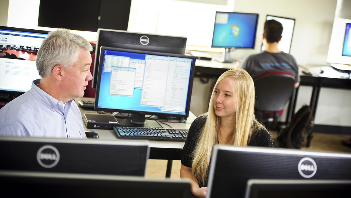 This is myself in 10 years as a computer scientist. I want to be a computer scientist because I would love working in a field where very title women are found, swell as working with computers. In 10 years I have a steady income and a husband. I will be eating healthy and having a strong family relationship with my loved ones. When I am not at work, I am training for a half marathon and potentially having my first child. In the image above, I am in an office for a major corporation, brainstorming new innovations for the company. With a Celebrity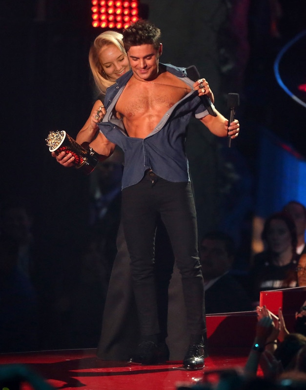 I am with Zac Efron in the image above. He just won an award for best shirtless appearance and for some reason I felt the urge to rip off his shirt. Photoshopping my face onto Rita Orta's, I would be the one who presented the award to him, instead of her. Wanting to show the crowd what exactly he won the award for, I wanted to take the opportunity while I had it. I went behind him and as casual as possible, began to take the top off. I chose this image because I thought it would be a fun little twist, due to myself being nothing close to the sorts. I am not usually as optimistic as Rita Orta, so I thought I would take the chance to show a different side of me that is out of the norm. Exercise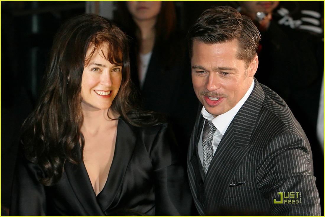 Steps in Photoshop:
1. I found an image that I wanted to photoshop my face onto. I did this through google images and used the advance search "large" to make sure the image was not grainy or too small. 2. I then saved the photo to my desktop and dragged the image to the photoshop icon. 3. After dragging the first image to the icon, I then dragged the image of myself to the icon. 4. To make sure the picture was not too small or too large, I went to image-imagesize-resolution-300 for both images. For the image of myself, I changed the height to 3 and for the one I wanted to photoshop, changed the height to 6. 5. I then dragged the image of myself by grabbing the top bar, and placed this on top of the image I wanted to photoshop myself onto. 6. I used the lasso tool to cut out my face and used the move tool to place the image on top of the face I wanted to change. 7. I then changed the opacity to 60% and began to do my image transformations. 8. When I was satisfied with my image, I changed the opacity back to 100% and created a layer mask. 9. I created the layer mask by clicking on the mask tool at the bottom of the page to create a new layer. 10. I chose the paintbrush tool and change the top color rectangle to black 11. By changing this to black, I am able to use the paintbrush as an eraser, but if i messed up, I changed it to white and was able to paint on what I erased. 12. When i was satisfied with the cut, I then changed the color balance and brightness/contrast to adjust the skin tone. 13. When that was completed, I merged the layers (layer-merge visible) and saved the image as a jpeg to my desktop and classroom folder. I also saved the image as a photoshop file onto my desktop. Before AfterCrop
Framing
Leading Line
Rule of Thirds
Symmetry
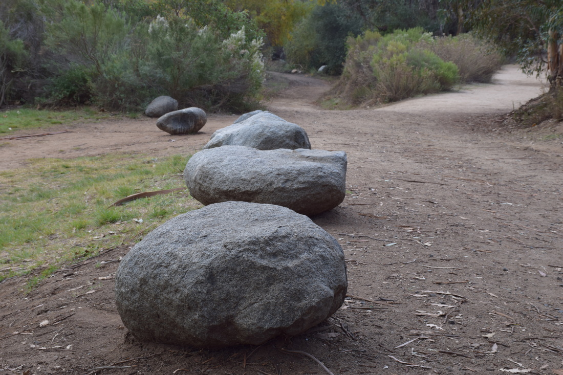
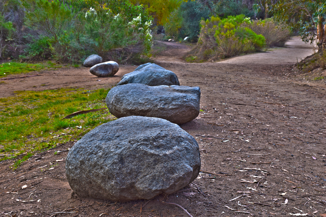
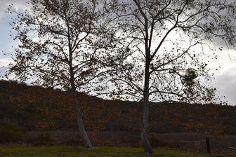
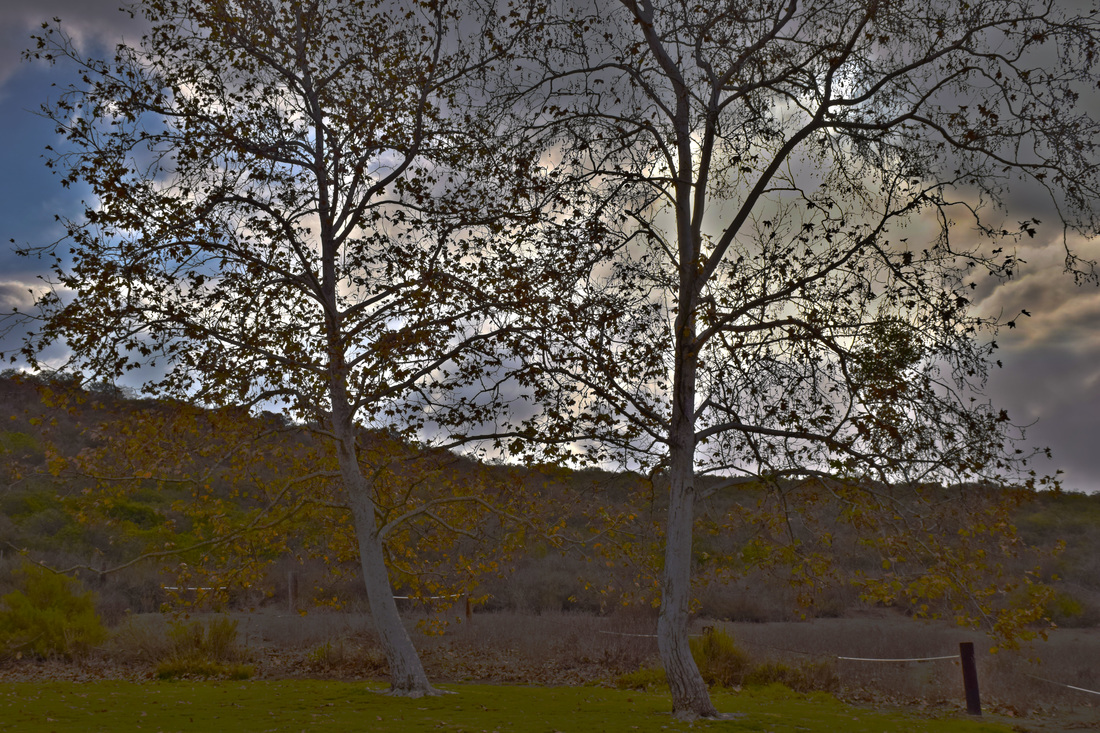
HDR stands for High Dynamic Range. This means that the camera will process photos slightly differently than normal in order to capture greater detail from bright and dark areas in the photo. What I did in order to capture the different compositions was take five photos with two negative half stops, two positive half stops and a photo with 0.0 compostion. A tripod was used in order to maintain the focus of the image and reduce variability between the five images. In order to ehance the images in photoshop, I first automated the photos in HDR format, which led the photos to be layered automatically. After layering the images, I removed ghosts, saturated the image and added highlight.
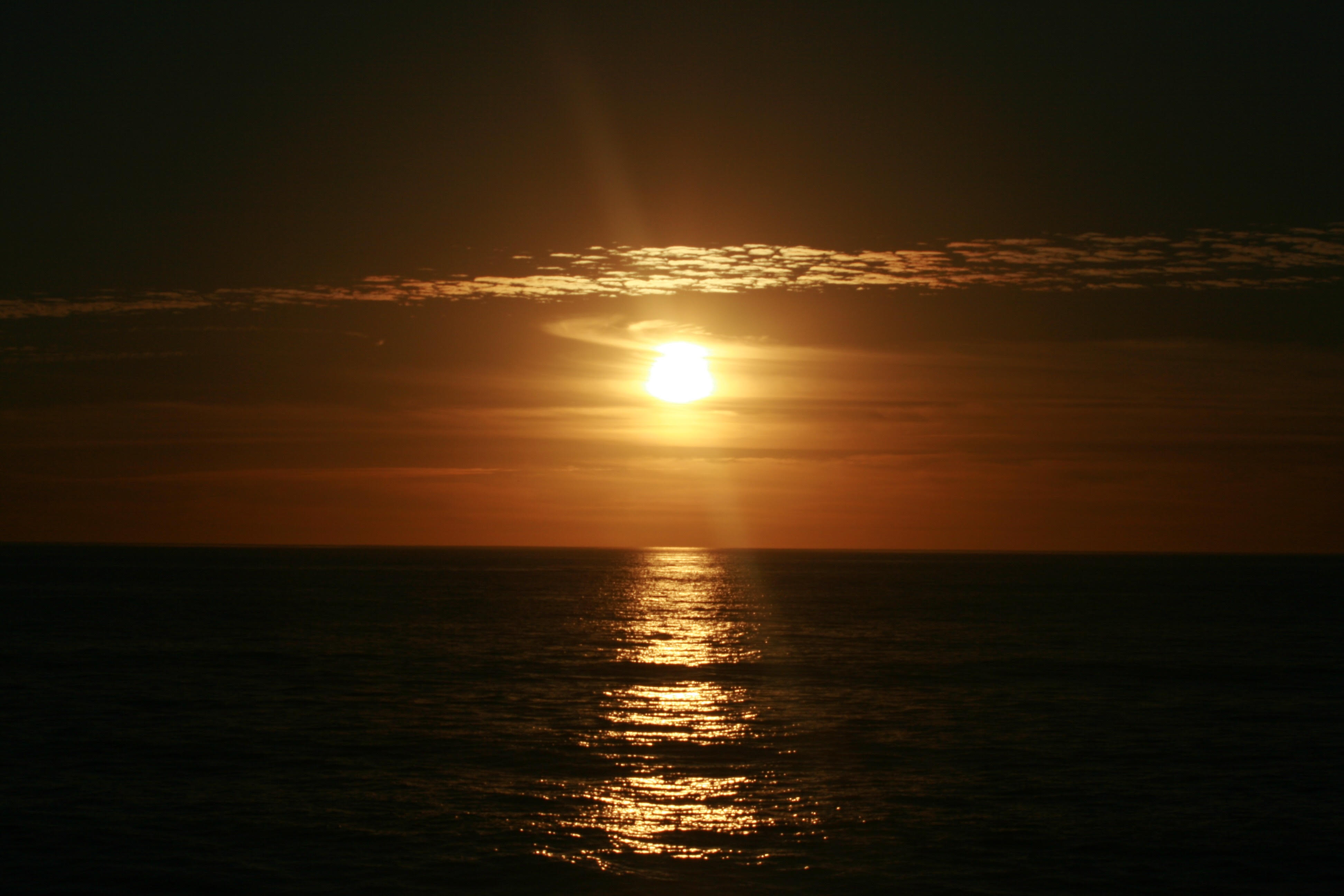
To photograph the moon:
1. Use a tripod! A flat surface will only allow you to shoot straight, and shooting the moon means that you'll be shooting up and constantly re-adjusting the tripod as the moon moves throughout the night. 2. Use a shutter release cord, remote or the camera's self timer if you don't have one, so that you don't move the camera when pressing the shutter release during a long exposure. 3. Use a zoom lens and zoom in as much as you can to the moon. It's okay if it's not a super fancy lens, this was shot using a 15 year old $100 lens. Focus in on the craters and details on the moon. 4. ISO 1250- 1600, so that you can use as fast a shutter speed as you can without losing detail-the longer the shutter speed, the more chances you have the camera will shake even slightly in the wind, resulting in an out of focus photograph. 5. Aperture priority of f/5.6 since you are not worried about capturing any details other then the moon. 6. Bracket your exposure, meaning over expose and underexpose the photograph from what the camera is telling you. Generally the camera will overexpose the moon, so you'll get nothing but a white blob in the sky. Use the exposure compensation button (the +/- button below the shutter release) and change the exposure to -0.5, then -1.0, then -1.5 and so on, until you start seeing detail in the moon. You may go as far as -5.0 exposure compensation to get what you need. 7. Take a fair amount of photos and keep refocusing as the night progresses. The photographs may look focused on the camera's display, but you won't really see if they're completely in focus until you upload them onto your computer screen. |
AuthorMaddy Cuppett, an exploring, excited photography student in the learning. Archives
June 2017
Categories |

 RSS Feed
